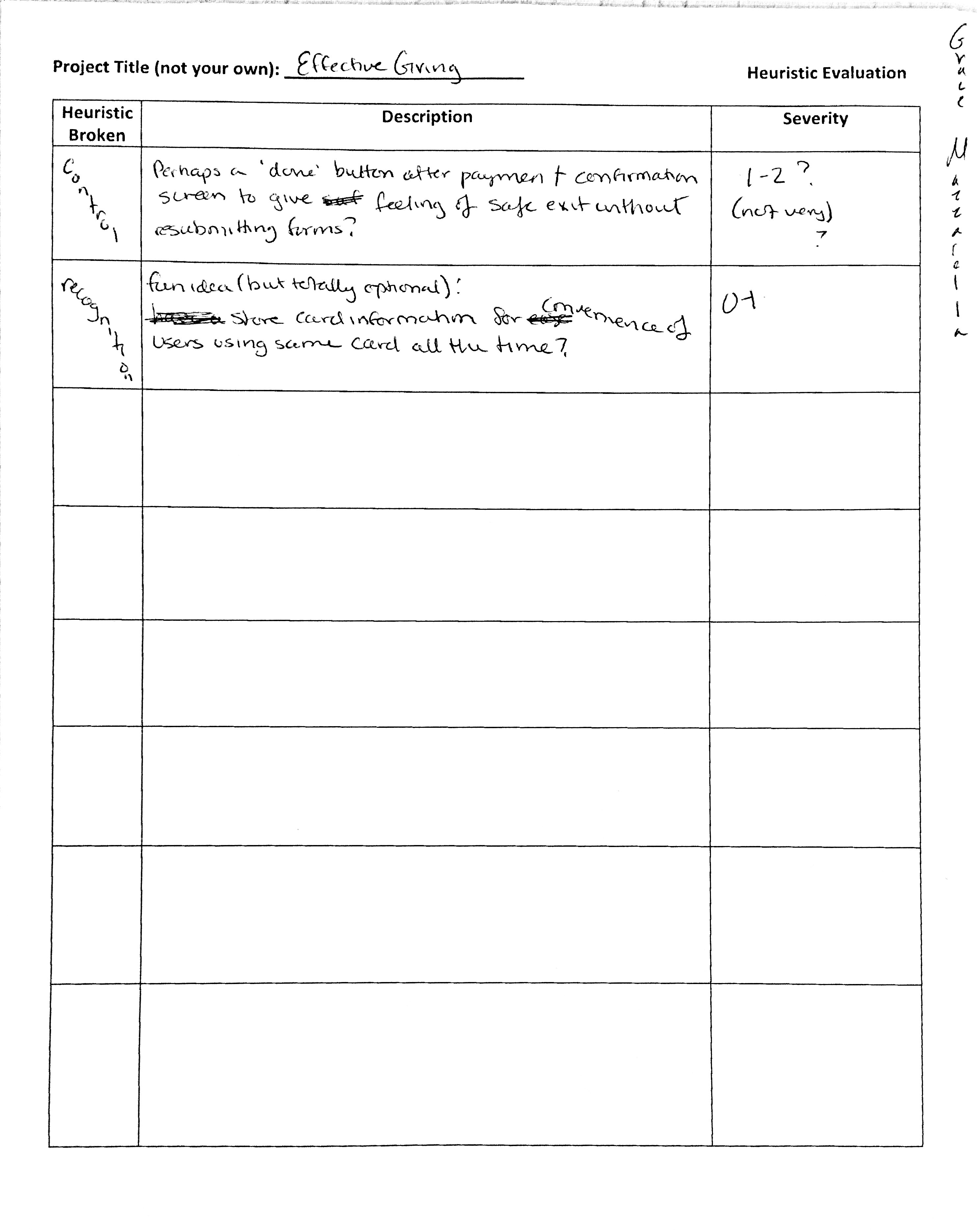
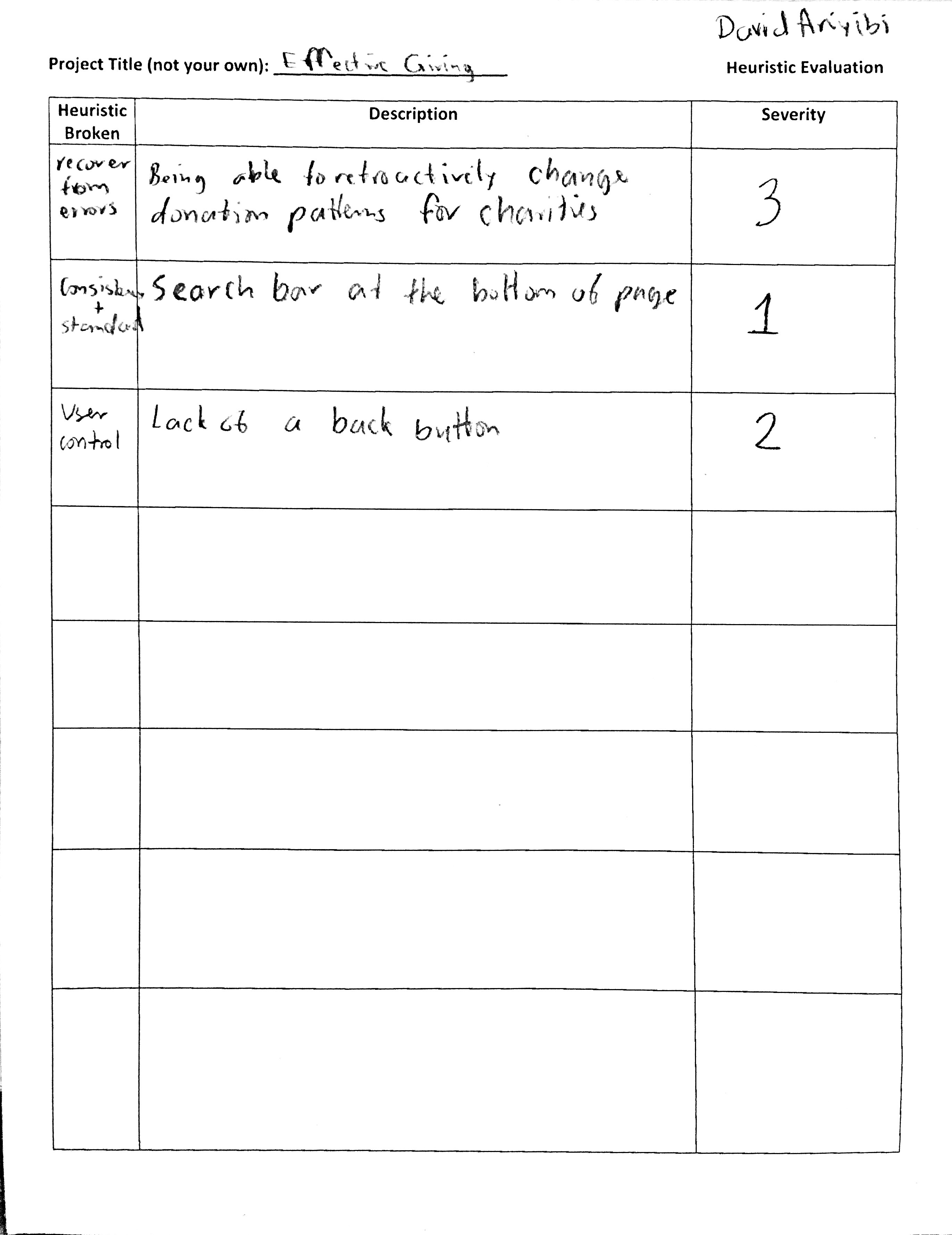
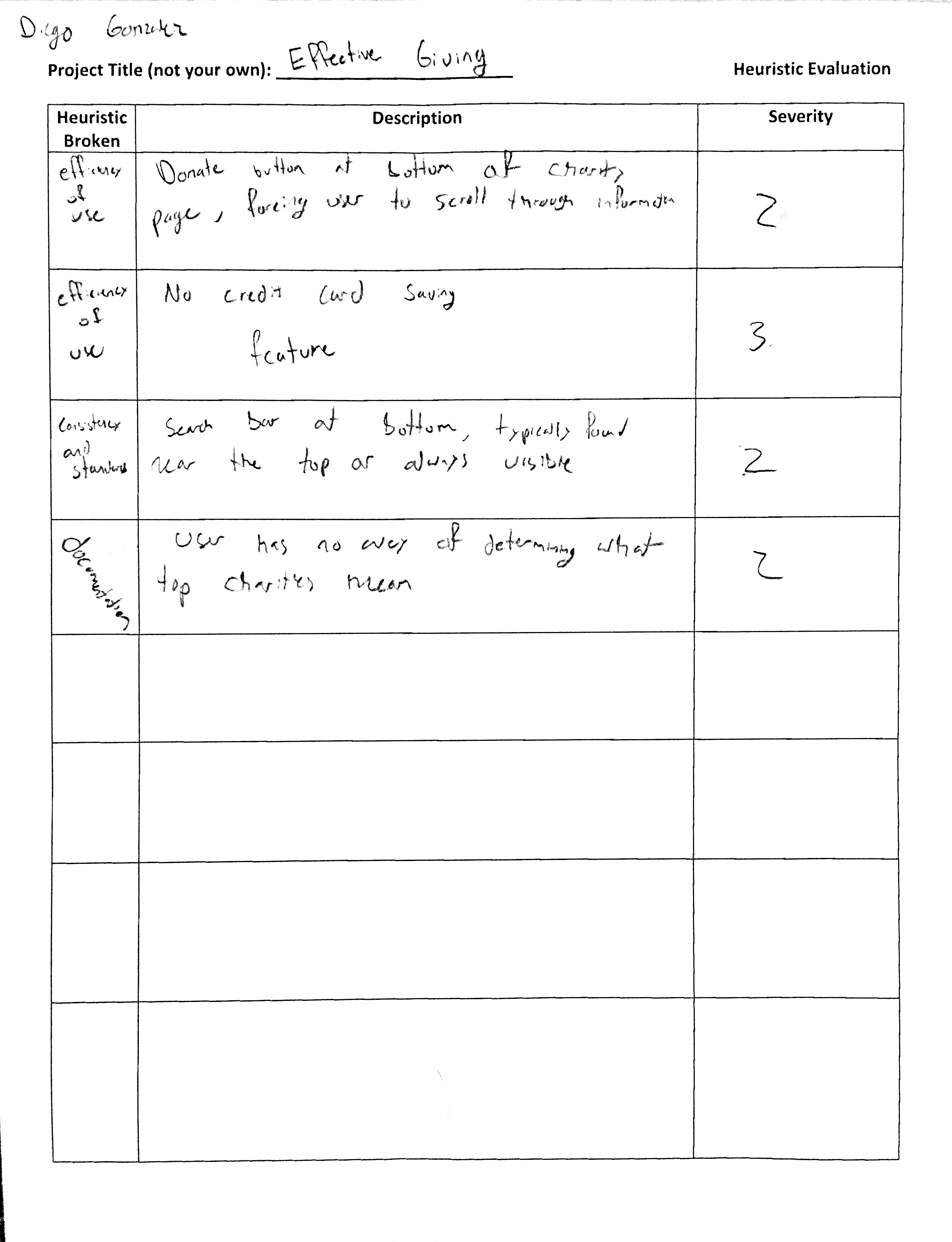
We obtained three heuristic evaluations. We broke up into two groups: - Mia and Tiffany (our team members) and Grace Mazzarella (from A2A group) - Michael (our team member), David Ariyibi and Diego Gonzalez (From Sous Shopper group)
Overview image of our paper prototype: 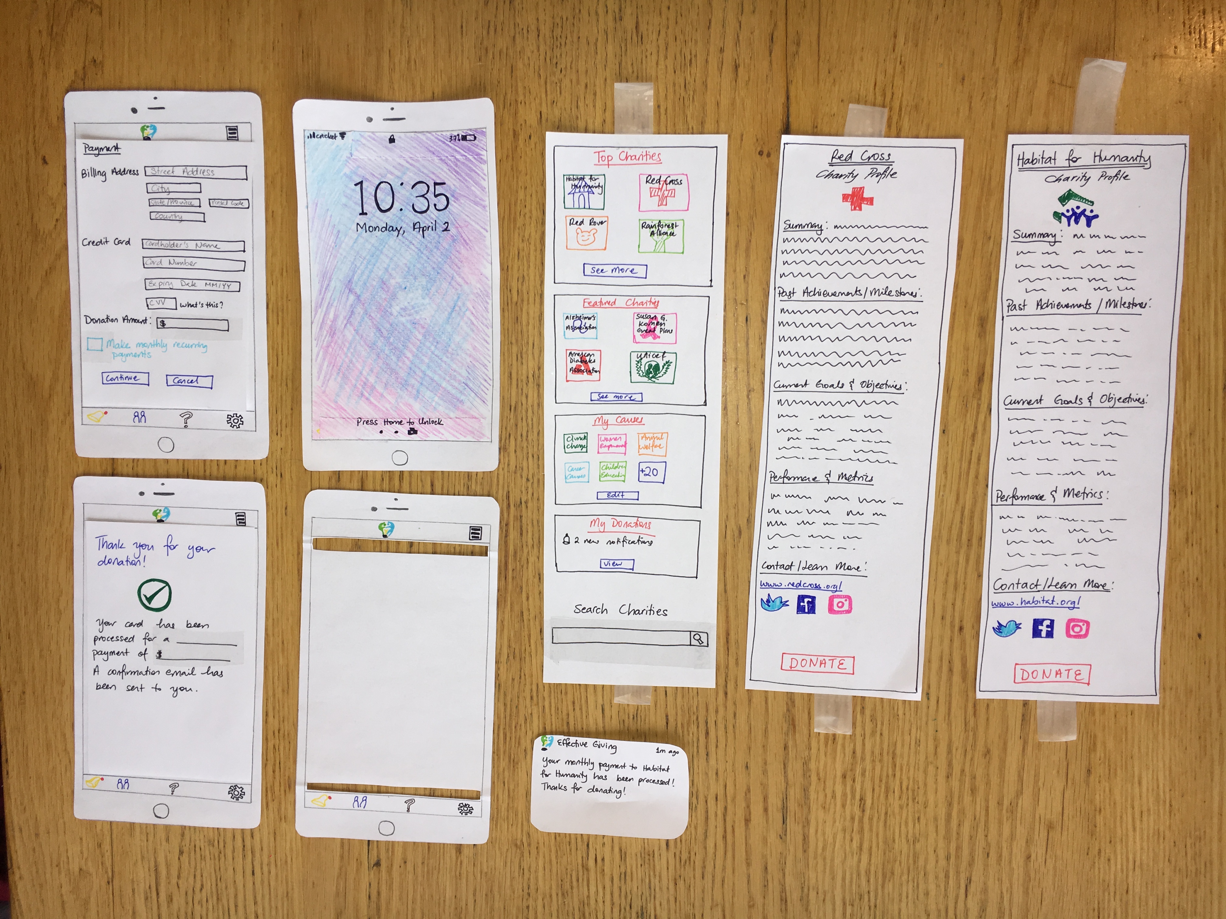
There are a few adjustments that we need to make to our paper prototype according to the feedback we got from the heuristic evaluations: - Move the search bar on the home page from the bottom to the top (more intuitive and adheres to existing standards) - Add a done button after payment confirmation screen to give the user a feel of a safe exit - Store card information for users that use the same card all the time - Add a distinct back button so that users can return to previous screen - The ability to retroactively change donation patterns for charities - Reconsider the position of the donate button so that users can avoid scrolling through information - “Top” charities is ambiguous and users may have no idea what it means