Heuristic Evaluation
Identified Issues
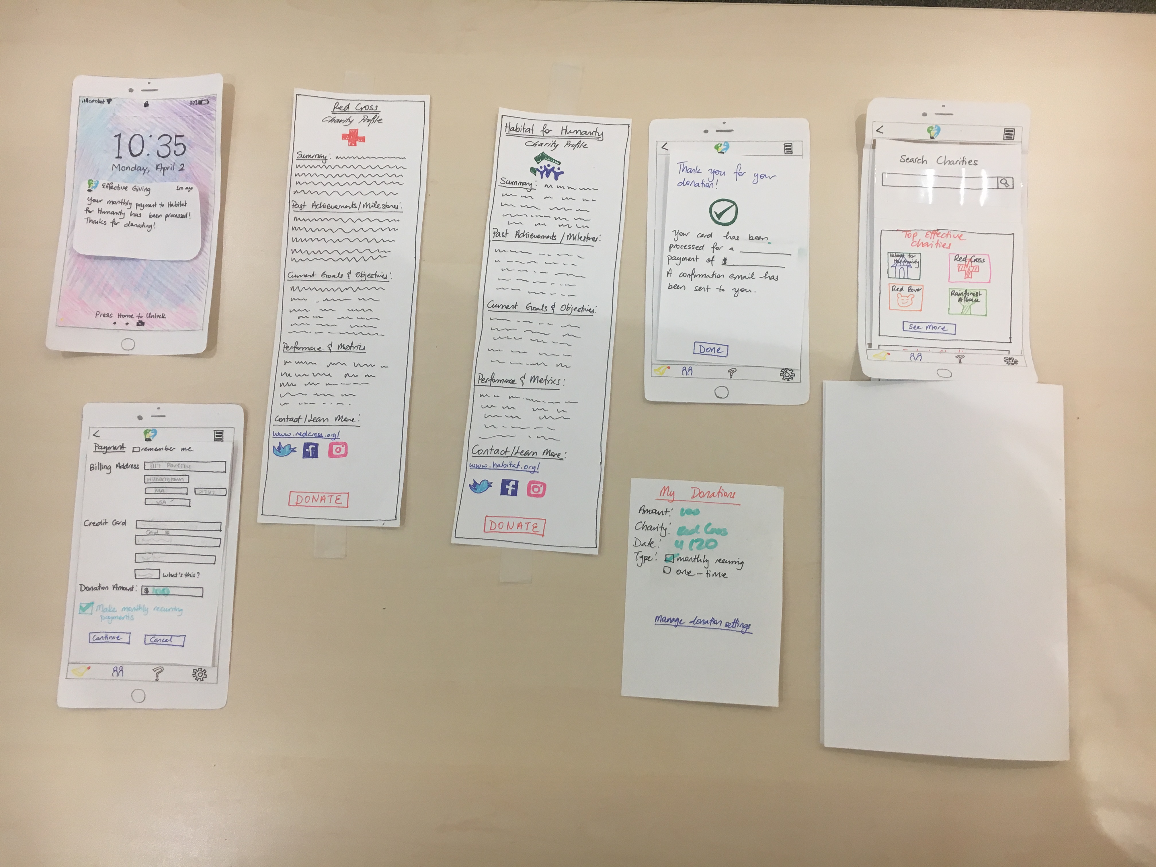
Issue: Move the search bar on the home page from the bottom to the top
Heuristic Violated: Consistency and standards
Severity: 1
Revision: Search bar moved from top to bottom
Issue: Add a distinct back button so that users can return to previous screen
Heuristic Violated: User Control
Severity: 2
Revision: Back and forward button added to the top left corner of every screen 
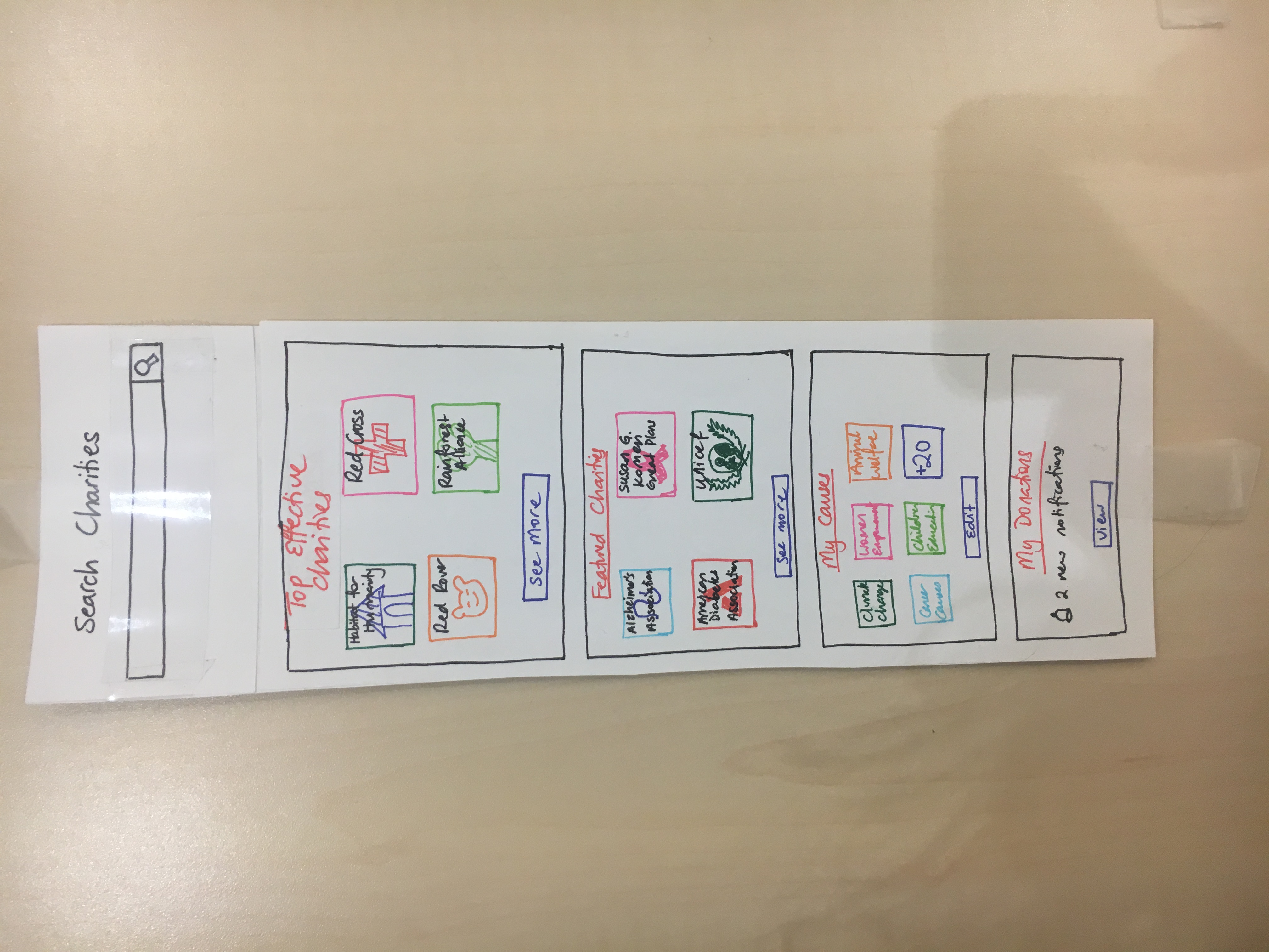
Issue: Top Charities too vague of a name
Heuristic Violated: Documentation
Severity: 2
Revision: “Top Charities” Categories title was changed to “Top Effective Charities”. Our goal is to have users understand that we are promoting charities that have high-impact per donation dollar. 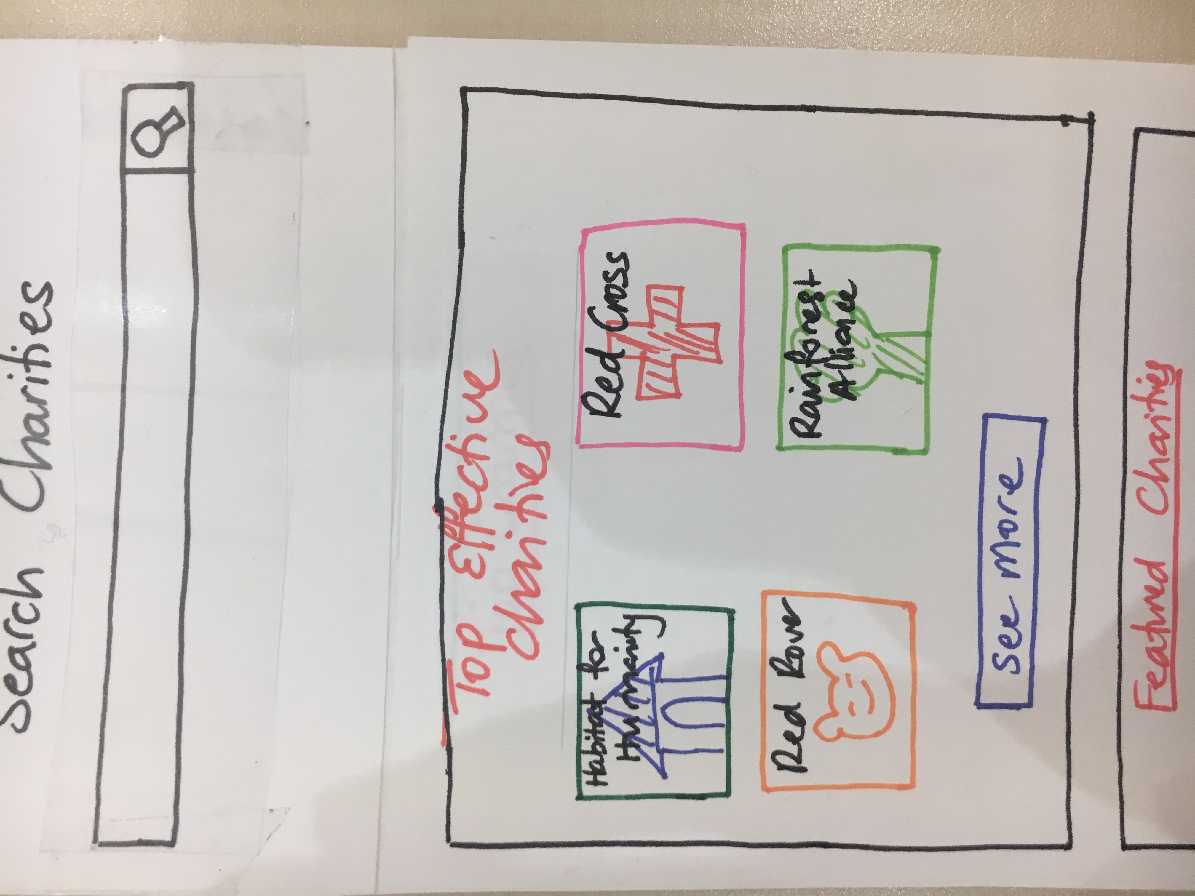
Issue: Credit card information storing option
Heuristic Violated: Efficiency of use
Severity: 3
Revision: A remember credit card information check box was included at the top of the payment screen. 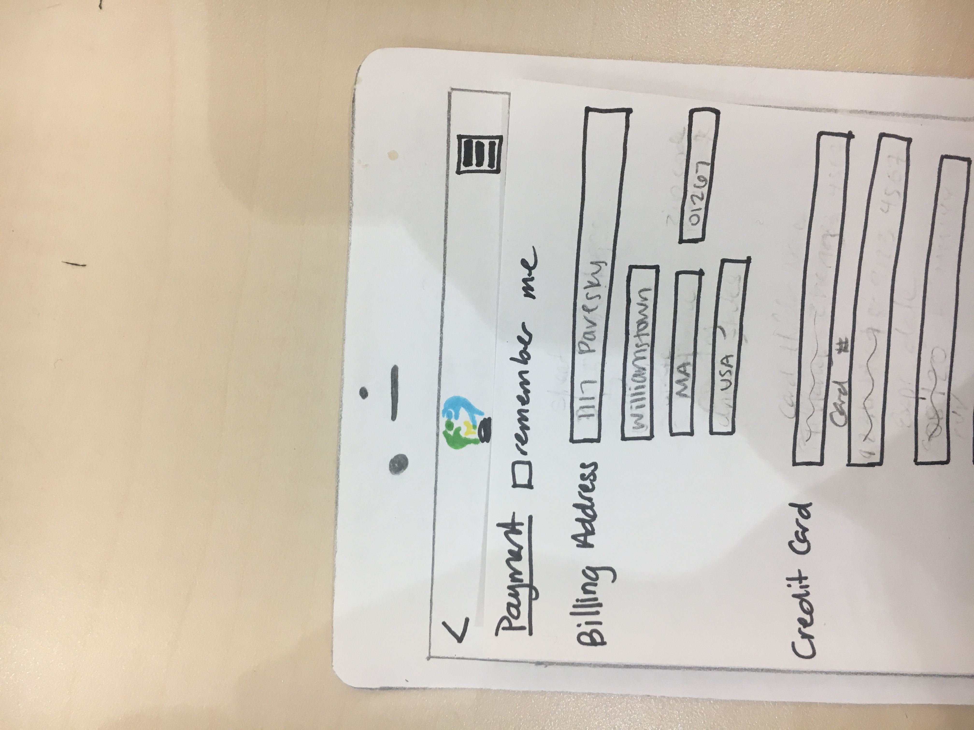
Issue: Being able to retroactively change donation patterns for charities
Heuristic Violated: Recover from errors
Severity: 3
Revision: Users can view their donation transaction history from the my donations page. When looking at a monthly recurring donation, users can click on the manage donation settings and adjust the donation pattern moving forward. 
Issue: Donate button at bottom of charity page, forcing user to scroll through information
Heuristic violated: Efficiency of use
Severity: 2
Revision: We did not implement a revision in regard to this issue. The goal of the Effective Giving app is to encourage our users to read and learn about a charity before they make any decisions, which is why we have our users to scroll through the information before they can see the donate button. As a result, we do not think convenience should take precedence in this design choice.
Issue: Done button for payment confirmation
Heuristic violated: Control
Severity: 1
Revision: We decided to add a done button on the confirmation screen so that the user could have a greater sense of control. The done button would also provide the option of going back to the home screen of the app. 
First Usability Test
Our participant was a freshman at Williams. She is a devout Christian who regularly attends Sunday Mass at a local Christian Bible Church. Her profile fits that of the local churchgoer demographic that our design targets. The test was performed in Room 129 Schapiro during the evening. We chose this location because it would be free from distractions For the test, we assigned one person to take notes, one person to simulate the app, and one to videotape the process. We introduced the usability test to the participant by providing a) a description of what Effective Giving project is and what our goals are, b) a short description of the tasks we wanted her to perform (learning about effective charities, and choosing one to donate to) and c) a brief overview of how everything worked. In regard to part c, we explained what each of us would be doing while the participant would be exploring the app (videoing, simulating the app, taking notes), encouraged her to think out loud, and made it clear that we were testing the design, not her. If she found anything confusing, it was the fault of the design.
Critical Incidents
Participant quickly able to choose a charity and make a donation
This is incident has both positive and negative aspects. On the one hand, the fact that our user could quickly click through and figure out how to use the app indicated that our design was intuitive and easy-to-use. Our participant remarked at the end that the design was “straightforward”.
On the other hand the goal of our design was to encourage users to take the time to learn about charities, weigh their options, and then make a decision. The fact that our user did do so may be a result of a faulty test design, rather than the result of a failed design overall. For example, because the prototype did not contain any real text or information, the participant did not have any content to explore in making their donation decision. Our participant also knew that the number of screens we could show her was limited going into the experiment. This knowledge most likely contributed to the quick decision time.
Checking info in notification was easy
Our user opted to make a monthly recurring donation. When we simulated our app bringing up a notification that her monthly recurring donation was successful, our user was able to quickly figure out how to view details of her donations and manage donation configuration settings. 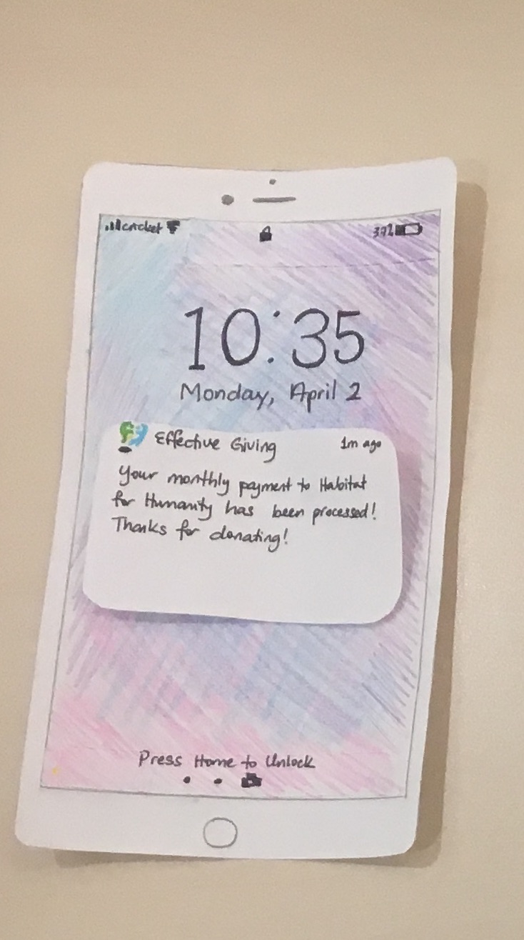
Revised prototype
Overview image
Task Walkthrough
View walk-throughs of our two tasks here
Plan
Our prototype was ultimately limited in how far in could test our original goal: encouraging users to explore effective charities and learn how to make more effective, thoughtful donation decisions. It was challenging to recreate a completely accurate and realistic donation experience. Our user opted for donating $100 every month. We are unsure if this amount would be entered if real money were used. Moreover, because of the limited number of screens and actual content on our prototype, we are unable to determine how successful our design would be in encouraging users to explore and learn.
Moving forward, we would like to improve our test trying to find ways to encourage real behavior on the website. For next time, the user will not be able to see the total number of screens available, and we may preface by saying although no real content is on our paper prototype, we would like to the user to explore the prototype as if it were an app with real content on it. In order to also address the issue of realistic donation behavior, we may also preface the test by emphasizing that the user should imagine that this is a real life scenario and pretend that they are using money from their real bank account.
We would also like to find participants to represent the remaining demographic groups that we’ve chosen to design for, specifically effective altruists and representatives of charitable organizations. The roles we’ve designated each team member will stay the same.