We conducted three usability tests and reviewed our paper prototype according to the insights we gained from this process. We asked our participants to perform two tasks: 1) learn about effective charities and 2) give without sacrificing convenience. We presented these tasks the same way to these three participants. We felt that recreating the task processes in our scenarios (simply searching for “Red Cross” and making a monthly recurring payment to Habitat for Humanity) would not give us much insight on the usability of our app since those processes are rather short and straighforward. Instead, we presented our tasks to the participants more generally by first asking them to 1) use our app to learn about charities and their effectiveness and afterwards 2) choose a charity to donate to. We informed them which charity profiles were “under construction” and which ones we had ready. Although the monthly recurring payments are a part of the “convenience” aspect of our second task, when the partipants were ready to donate, we let them decide whether they wanted to make a recurring payment to gauge the appeal of this feature.
Usability Test 1
Our participant was a freshman at Williams. She is a devout Christian who regularly attends Sunday Mass at a local Christian Bible Church. Her profile fits that of the local churchgoer demographic that our design targets. The test was performed in Room 129 Schapiro during the evening. We chose this location because it would be free from distractions. For the test, we assigned one person to take notes, one person to simulate the app, and one to videotape the process. We introduced the usability test to the participant by providing a) a description of what Effective Giving project is and what our goals are, b) a short description of the tasks we wanted her to perform (learning about effective charities, and choosing one to donate to) and c) a brief overview of how everything worked. In regard to part c, we explained what each of us would be doing while the participant would be exploring the app (videoing, simulating the app, taking notes), encouraged her to think out loud, and made it clear that we were testing the design, not her.
Critical Incidents
Participant was quickly able to choose a charity and make a donation
This incident has both positive and negative aspects. On the one hand, the fact that our user could quickly click through and figure out how to use the app indicated that our design was intuitive and easy-to-use. Our participant remarked at the end that the design was “straightforward”.
On the other hand the goal of our design was to encourage users to take the time to learn about charities, weigh their options, and then make a decision. The fact that our user did do so may be a result of a faulty test design, rather than the result of a failed design overall. For example, because the prototype did not contain any real text or information, the participant did not have any content to explore in making their donation decision. Our participant also knew that the number of screens we could show her was limited going into the experiment. This knowledge most likely contributed to the quick decision time. We revised our paper prototype accordingly for the next two usability tests by replacing the squiggly lines in our charity profiles with actual content about the charities so that we could gather more insight on how much time users spend reading the content.
Checking info in notification was easy
Our user opted to make a monthly recurring donation. When we simulated our app bringing up a notification that her monthly recurring donation was successful, our user was able to quickly figure out how to view details of her donations and manage donation configuration settings. 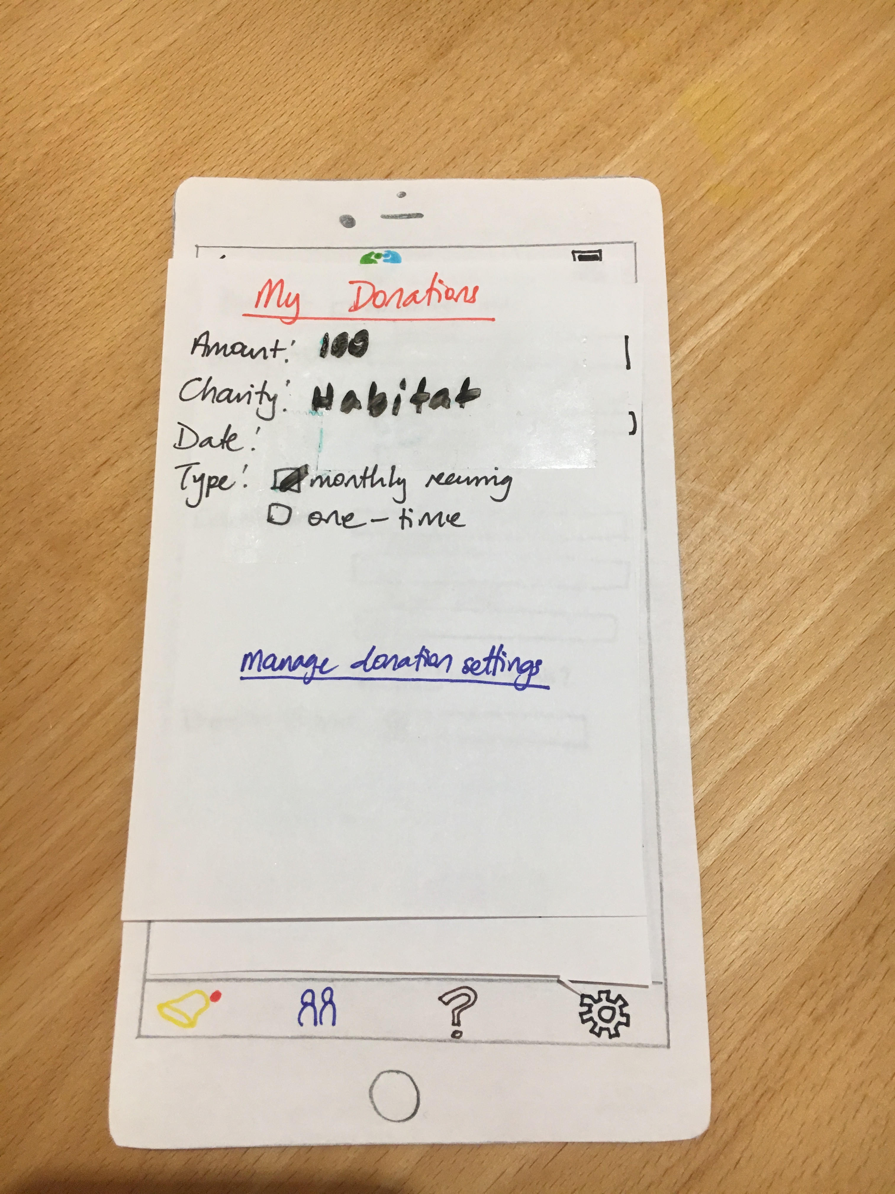
Usability Test 2
Our second usability test participant was a male undergraduate student at Williams. We chose him as a participant because of his quantitative background, and we believed his decision-making process would be similar to that of effective altruists. The usability test was conducted in the morning at Tunnel City Coffee. In contrast to the setting of our previous test, we wanted to observe how our design would perform in a more natural, relaxed environment with greater distractions. Only two of our members were able to make it to the test, and as a result, we decided to not videotape this test. Instead, before the test, two of our team acted as moderators, and during the test, one of us acted as a computer, and the other as a notetaker. The debriefing process was the same as our last test.
Critical Incidents
Difficulty finding the donate button
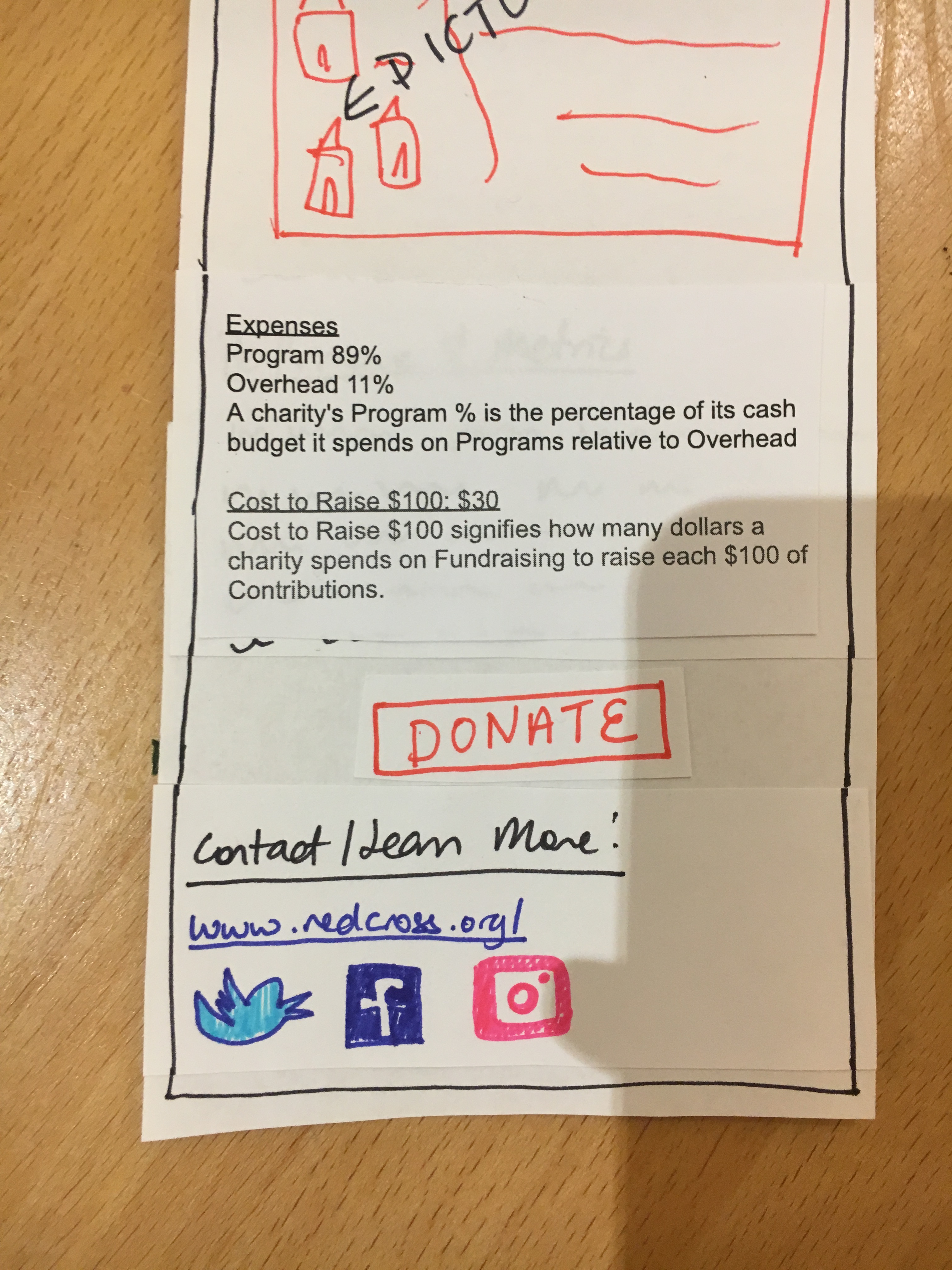
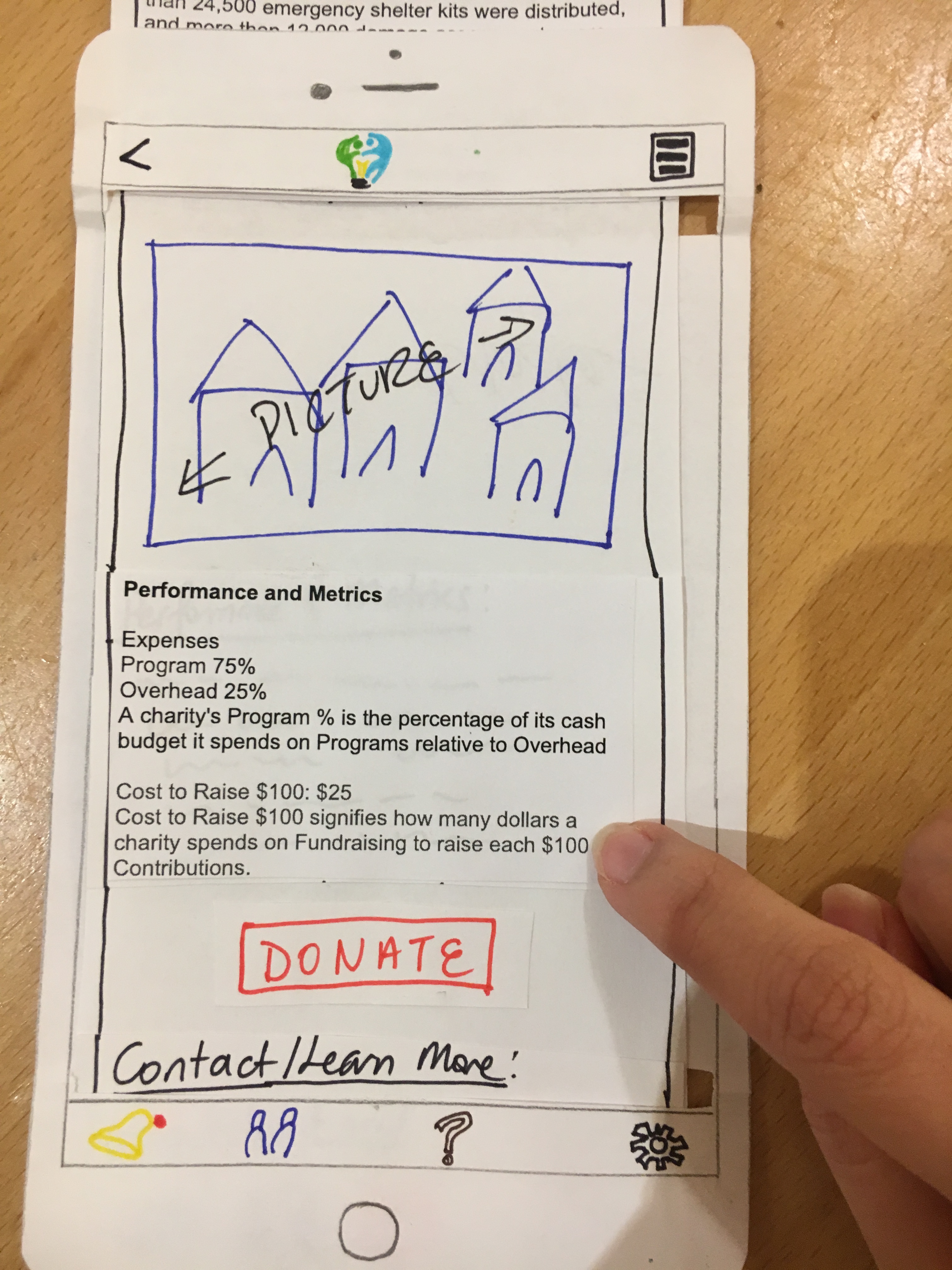
After reading about different charities, our participant chose to donate to one of them. Unfortunately, because the donate button was located at the bottom of the screen and because our participant did not scroll down far enough, our participant was unable to figure out how to donate. Instead, our participant went to the “My Donations” section at the homescreen, and, ultimately, was unable to find out how to donate by the end of the test. In order to both encourage users to read about a charity and to ensure that donate button is still found, we can revise our prototype by moving the donate button up above the contact info in a charity profile. The button is still at the bottom of the page so users won’t prematurely choose to donate, but the revision will make it the button more discoverable.
Comparing similar charities side by side
After reading a charity profile, our participant indicated that he would like the ability to read about similar charities, preferably side by side comparisons of major statistics and facts, in order to compare his options. While such functionality is beyond the scope of our paper prototype, the comment shed light on more complex features we can provide in order to further facilitate the decision making process for donors. 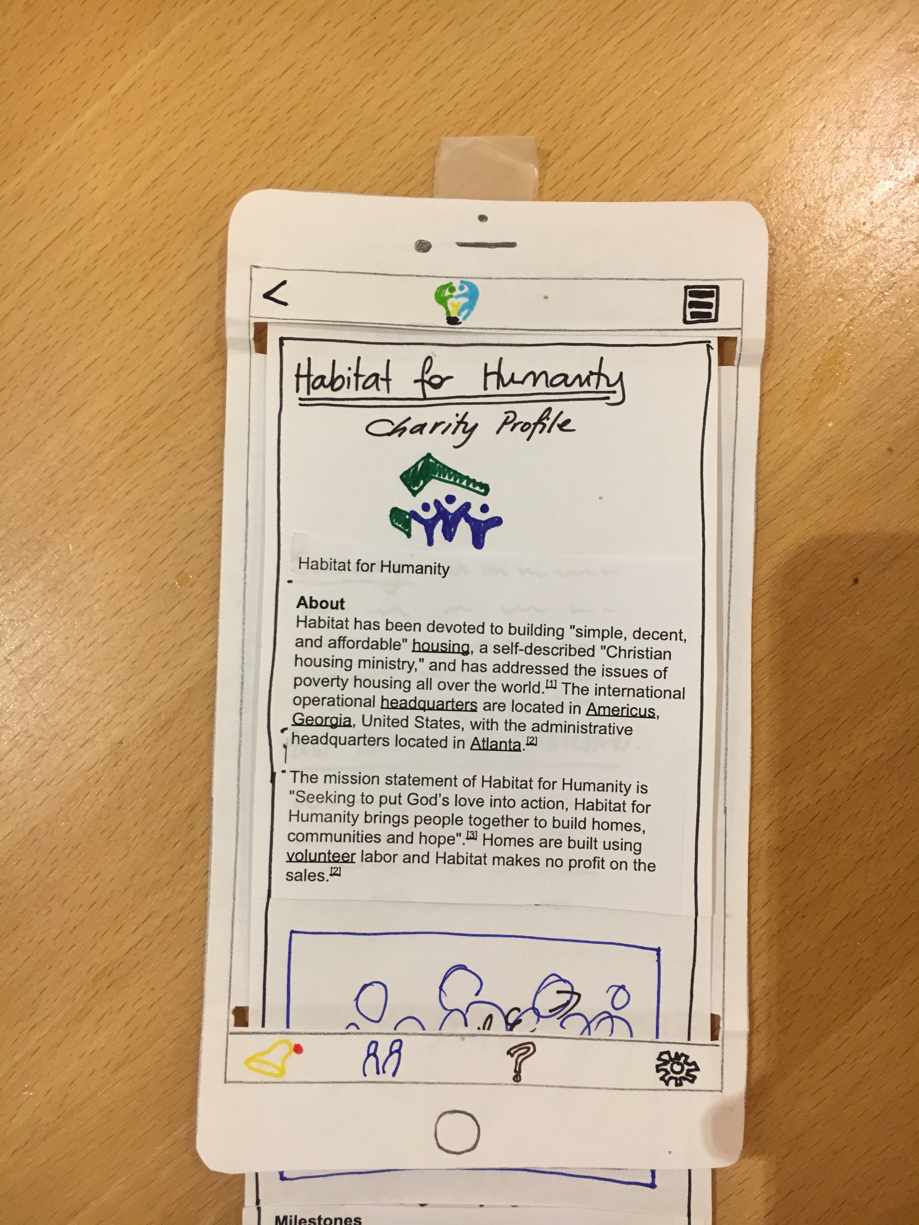
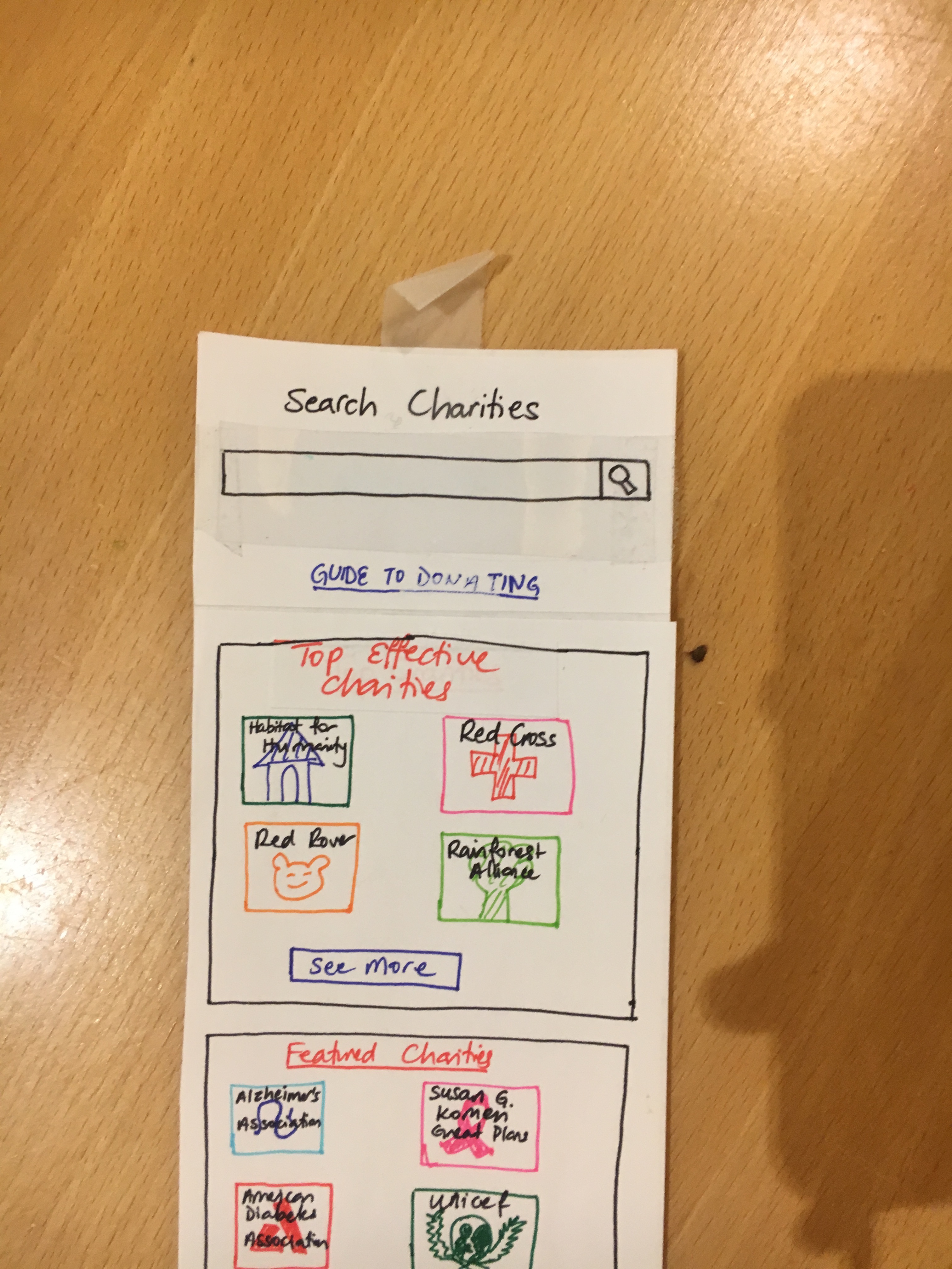
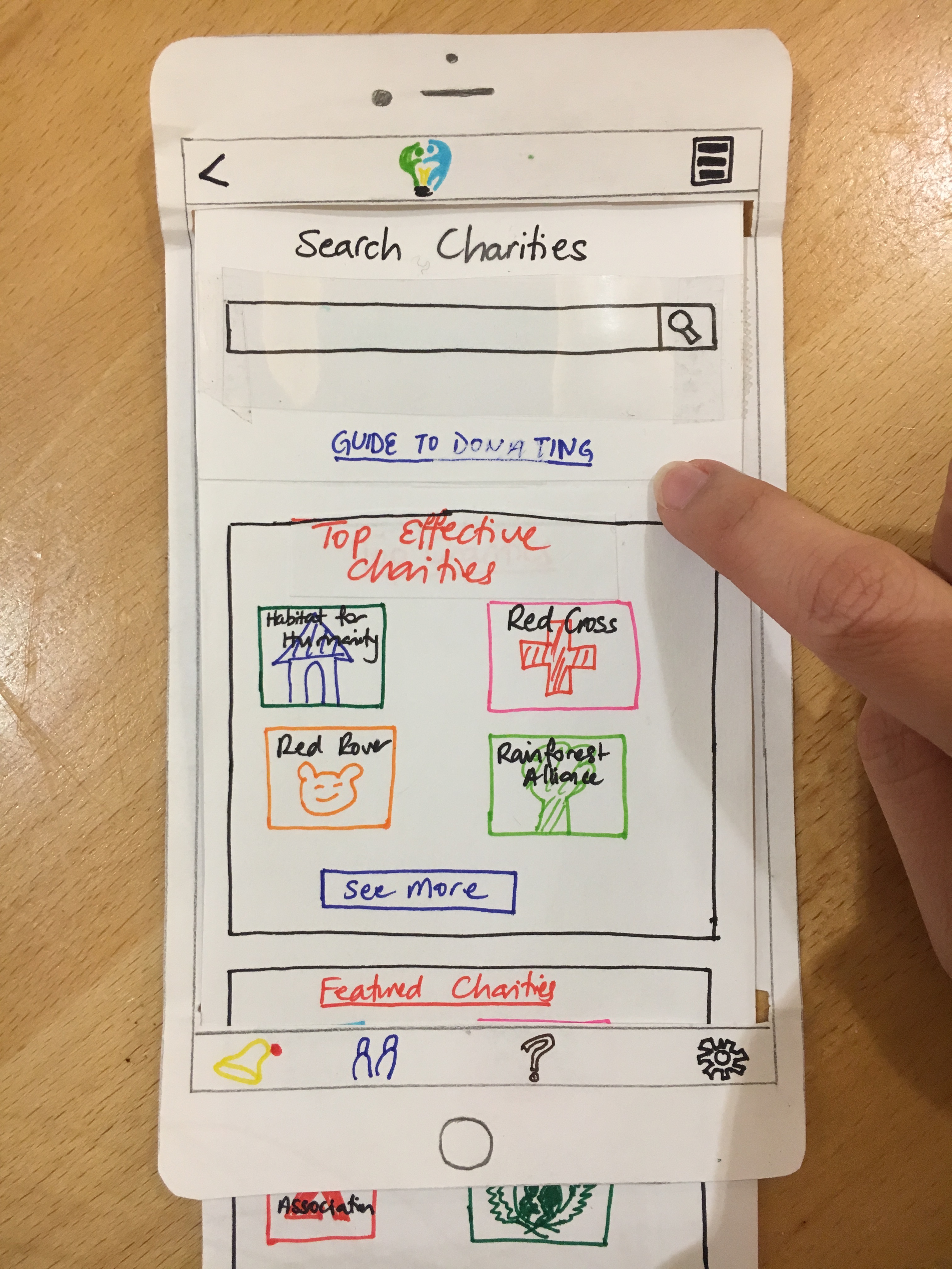
Link to a structured guide on how to make effective donation
While our user found the list of top charities as a good way to start the charity learning process, he commented that he would prefer to have a more structured way to approach investigating his charity options. One solution could to provide a link on the home screen of our app to a short guide to inform our users on how to approach the donation decision-making process. Providing a structured process that our users can start from could make the donation process more enjoyable overall.
Usability Test 3
Our third usability test was performed after in a room in West with a female student from Williams College. We chose this participant because of her involvement with larger charity organizations, since she has done work with CLIA in the past. Due the test happening on a Friday night, it was sometimes difficult to keep the test setting free of distractions because of lively activities in the buidling. However, this was hard to avoid given the participant’s schedule and availability of our team members. The distractions did not have a significant impact on our results, as our participant was engaged and focused. All team members were present: we had one member facilitate and take down notes, one operator for the the app model, and another to observe and track the resources to be used while testing the prototype.
We introduced our project, Effective Giving, to the user with a brief description, and set the user the first goal, to find and compare charities to decide whether to give money, and if so to continue to make the donation. We asked the user to think out loud, which was quite successful and helped reveal a few user experiences which may not be represented by normal procedures.
Critical Incidents
Placement of donate button after description text
The user commented that they liked the display of charity-related information above the donate button, such that the user would be required to scroll through the charity information before making a donation. It is good that we decided to keep this feature despite previous considerations to move it to the top.
Charity descriptions too long and/or text-heavy
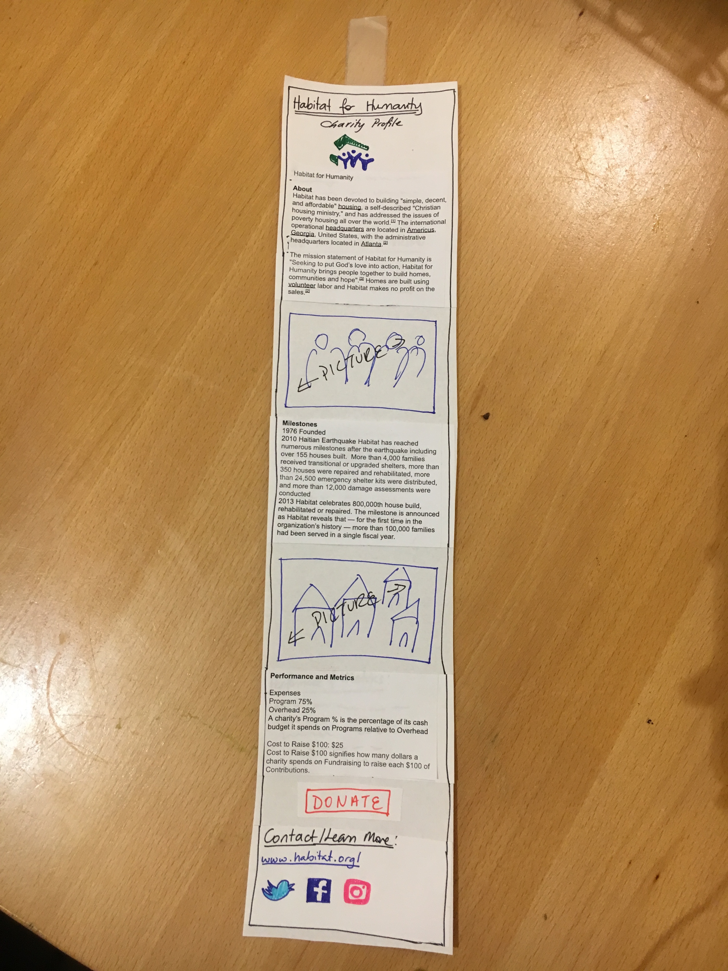
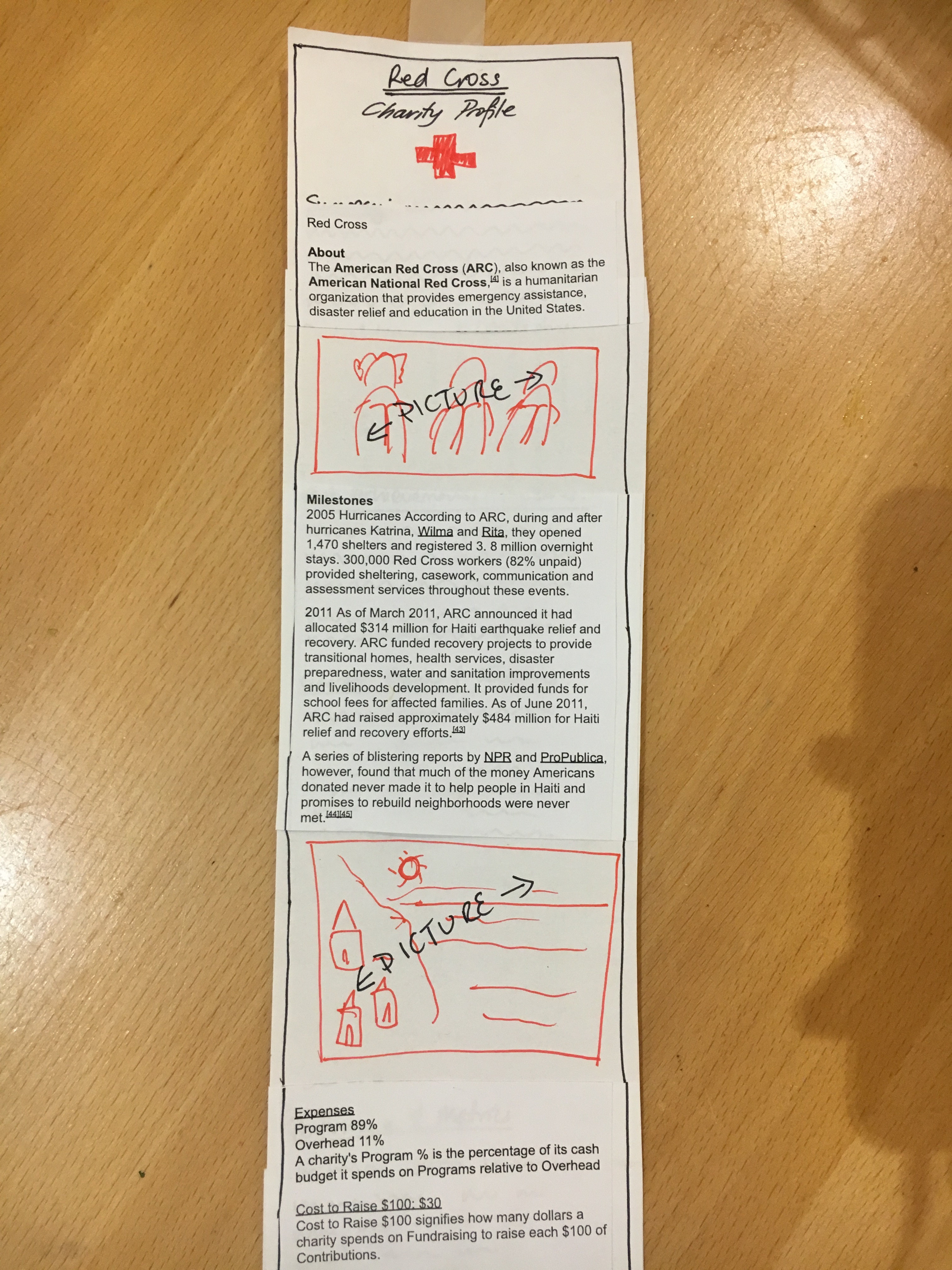
User noted losing attention while reading blocks of text as descriptions of charity. Suggested a “tl;dr” version, or the incorporation of pictures into the flow of the text. We revised our paper prototypes accordingly and added placeholders for images in our charity profiles.
App as a source of reading material about charities
After reading two articles on charities, the user wanted to continue reading articles about another charity. We stopped because we had no more charity descriptions prepared. We figured this is a problem we would run into given the scope of our paper prototype. However, we feel that the two profiles we currently have are enough to assess usability of our app in terms of our two vital tasks that we ask users to perform. We decided to stick with the profiles we have because a generic charity profile page for all our charities would not give us much additional insight, and adding profiles for each charity shown on our homepage is impractical:
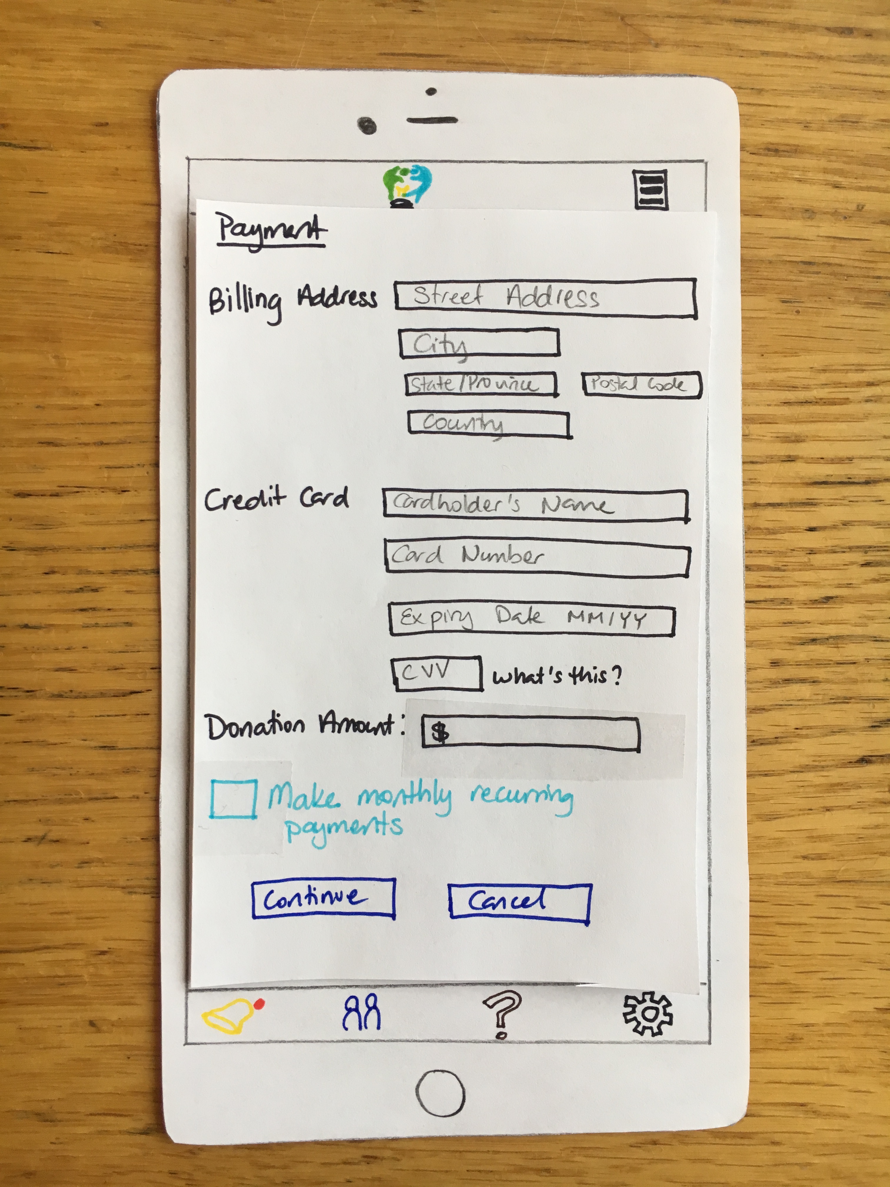
Explicit marking of donation type
User commented that she liked the explicit marking of one-time vs. monthly recurrent donations, and specifically chose to make the donation as a single-time event, rather than as a monthly recurring donation. Although this runs counter to our goal of increasing convenience, this suggests the existence of users who would rather have manual control over their payments.
Final Paper Prototype
See this page for our updated final prototype with the overview image and walkthrough of our two primary tasks.
Important Revisions
The most revisions our team felt were the most crucial were: - Adding a distinct back button: We identified this issue in our heuristic evaluations. It seems like an obvious addition, but it was overlooked at first. After conducting the usability tests, we realized just how important it was to allow our users to easily return to previous screens and activities, given that a large part of our app serves an exploratory purpose. The back button is utilized heavily when learning about different charities and making donations, as users change their minds often. Without this clear signal that they can do so, users can get frustrated and perhaps even give up on using the app if they feel too restricted.
-
Ability to retroactively edit donation patterns: This was another concern we identified in our heuristic evaluations. The financial circumstances and opinions of users change over time, so it would make sense that their donation patterns change. At first, our app did not have a clear, accessible option to users to change their donation patterns, assuming that they could do so by clicking on settings at the bottom of the menu. We adjusted our paper prototypes according to this concern and added a “My Donations” section on the homepage with a clear “view” option that users can click on to see and edit their donations. It became clear, especially in our usability tests, how much users appreciated this. Without this clear signal, users may not feel secure making monthly recurring payments because they do not see a clear option to change their donations in the case that they change their minds. This functionality is crucial to making our users feel in control of their actions, which is extremely important in a platform like ours that helps guide them in how to donate their money.
-
Adding pictures to charity profiles: We identified this concern in our third usability test. Our participant mentioned that the charity profile pages, which were primarily filled with text content, might appear boring after a while and people would feel discouraged from reading. She seemed engaged with the content, partially because she is interested in charitable giving and the test setting might have heightened her attention levels, but a large proportion of users might not be as engaged. The pictures are a simple alternative to keep users learning about effective charities more engaged with the information presented to them. Our goal is to help users make informed decisions about charitable giving, which cannot be possible if they lose interest in learning the relevant information to do so.