Overview
The following digital mockups walk through the two primary tasks of our design: 1) learning about effective charities and 2) giving effectively without sacrificing too much convenience. These walk-throughs are revisions of our paper prototypes.
Task 1: Learning About Effective Charities
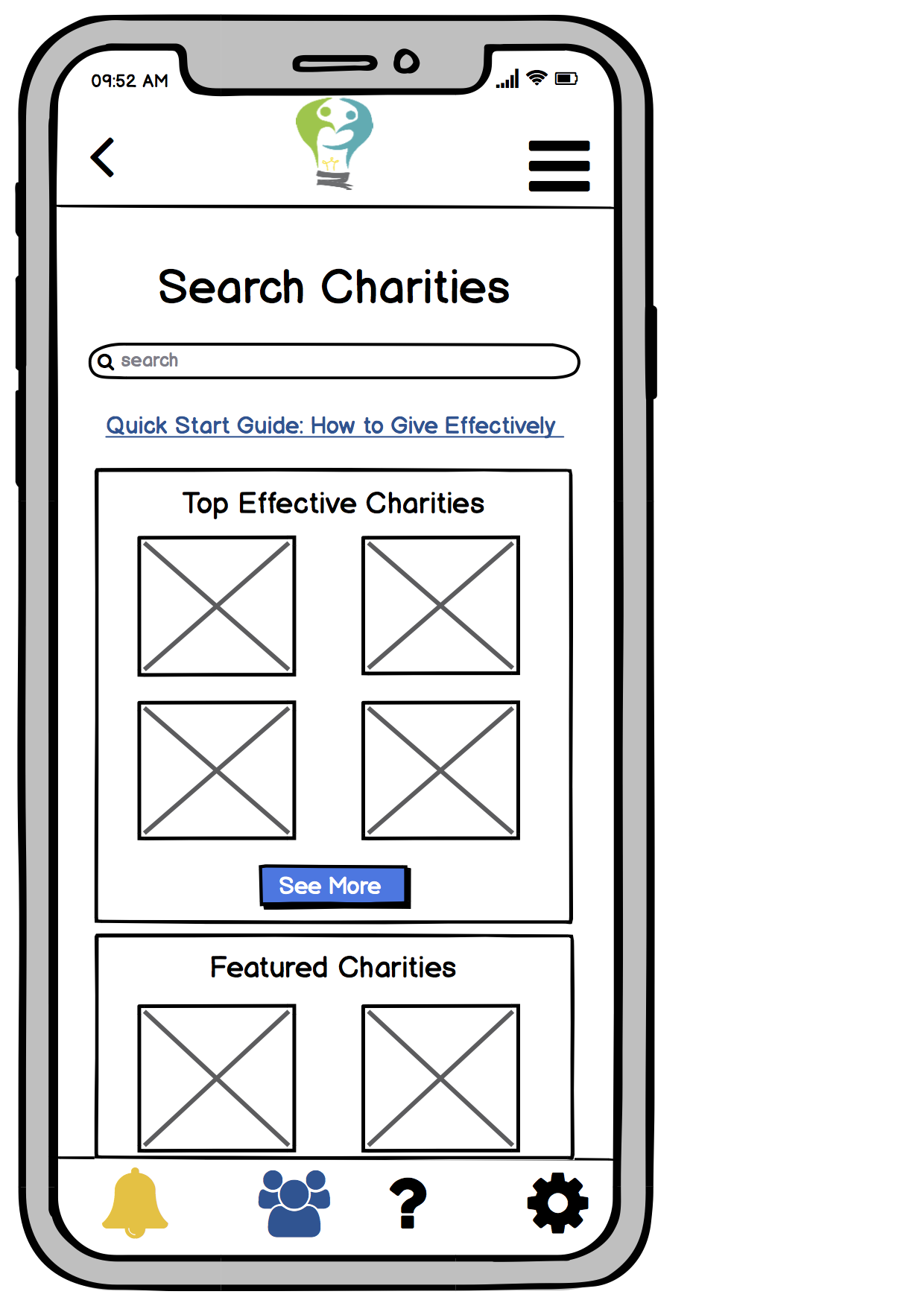
The homepage displays gives the user several options for the user to explore effective charities. A user can look at a charity from one of the categories (top charities, featured charities, etc.), look up a specific charity they may have heard about, or click the link to our quick start guide that will provide them with a structured approach to learning about and choosing a charity
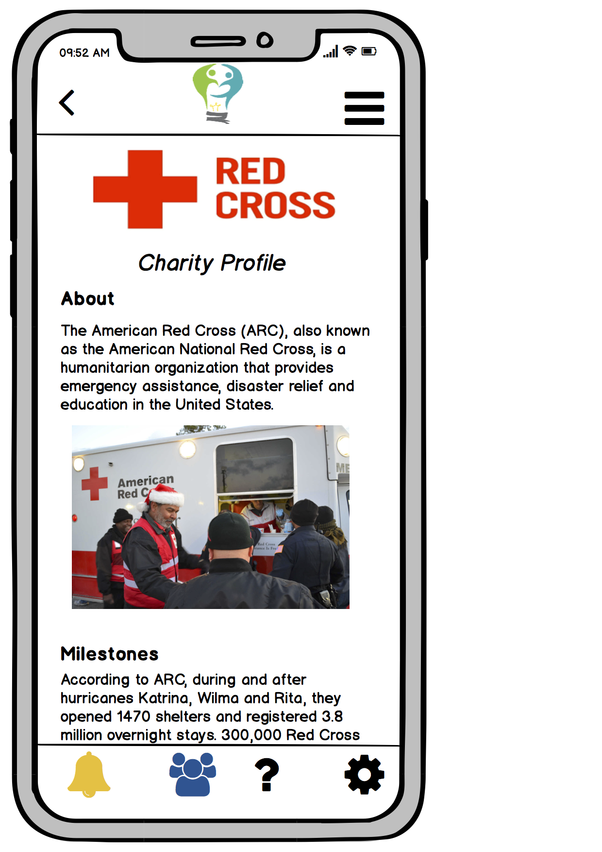
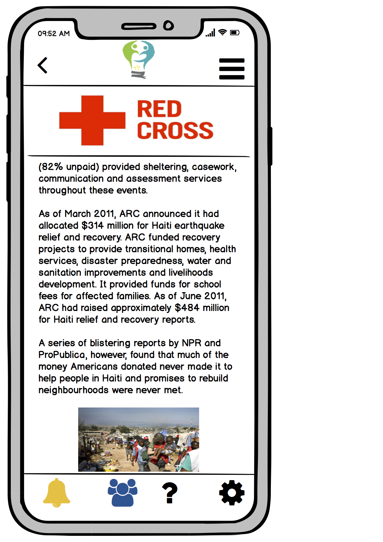
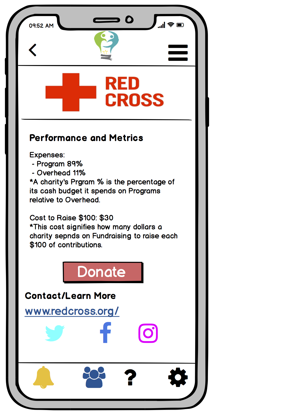
Once a user chooses a charity to learn about, the app presents them with a charity’s profile page, which provides information such as mission, milestones, achievements, and key statistics - all factors to consider in order to decide whether or not to donate to a charity. The following mockups show the charity profile pages for the Red Cross.
Task 2: Giving Without Sacrificing Too Much Convenience
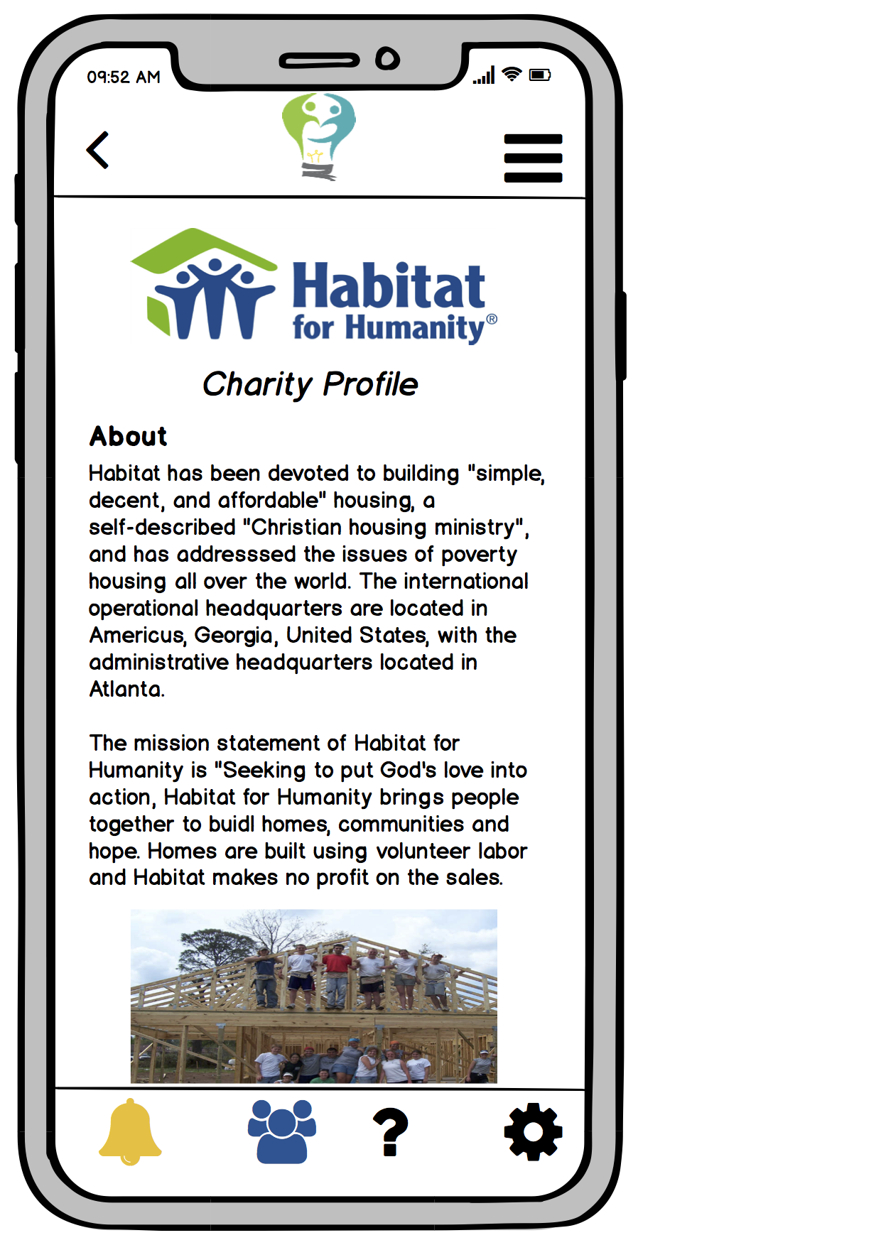
The user has done her research on charities and wants to donate to a specific charity that she cares about, Habitat for Humanity. She views Habitat for Humanity’s charity profile on the app.
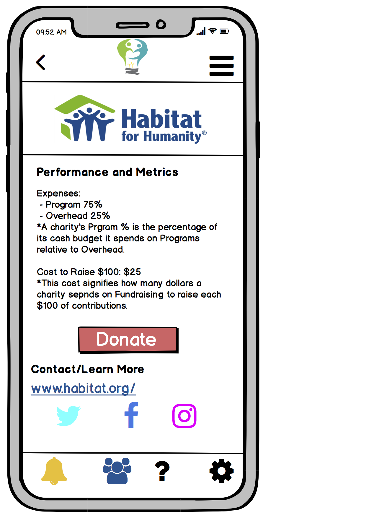
The user can scroll to the bottom of the charity profile page to the donate button.
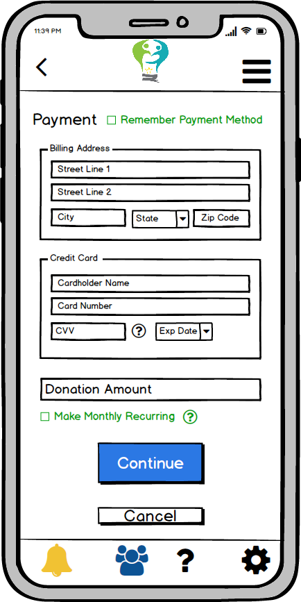
The user is then directed to a page where she can input her payment information in order to make her donation. The user then specifies how much money she wants to donate in the “Donation Amount” text field. She can also choose to make the donation a monthly recurring payment. If the user does not check this box, the donation will be a one-time payment.
The user can click on the “Continue” button at the bottom of the payment information page to proceed with her donation. If she clicks on the “Cancel” button instead, she will be brought back to the previous screen she was on, which was the charity profile for Habitat for Humanity.
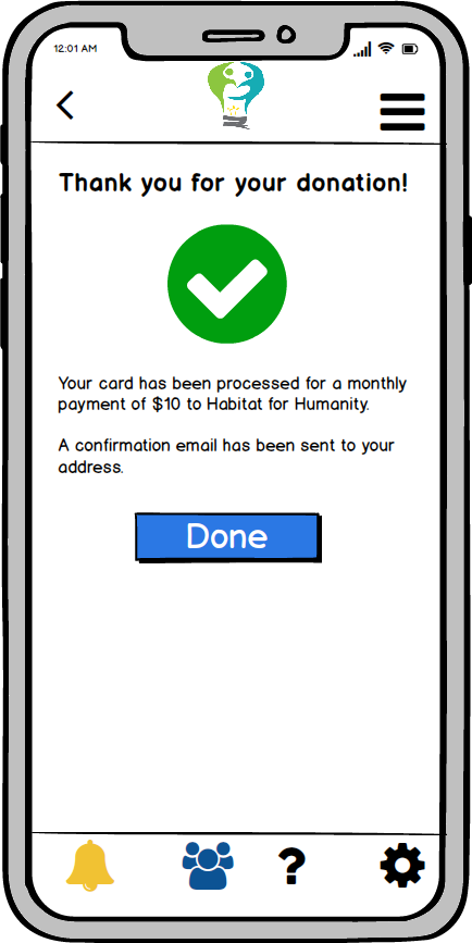
If the user’s credit card information is processed successfullly, she will be brought to a payment confirmation page. The user can then click on the Effective Giving logo to return to the home screen/dashboard. If the payment information was not processed successfully, a popup message stating this error will appear and the user will remain on the payment information screen.
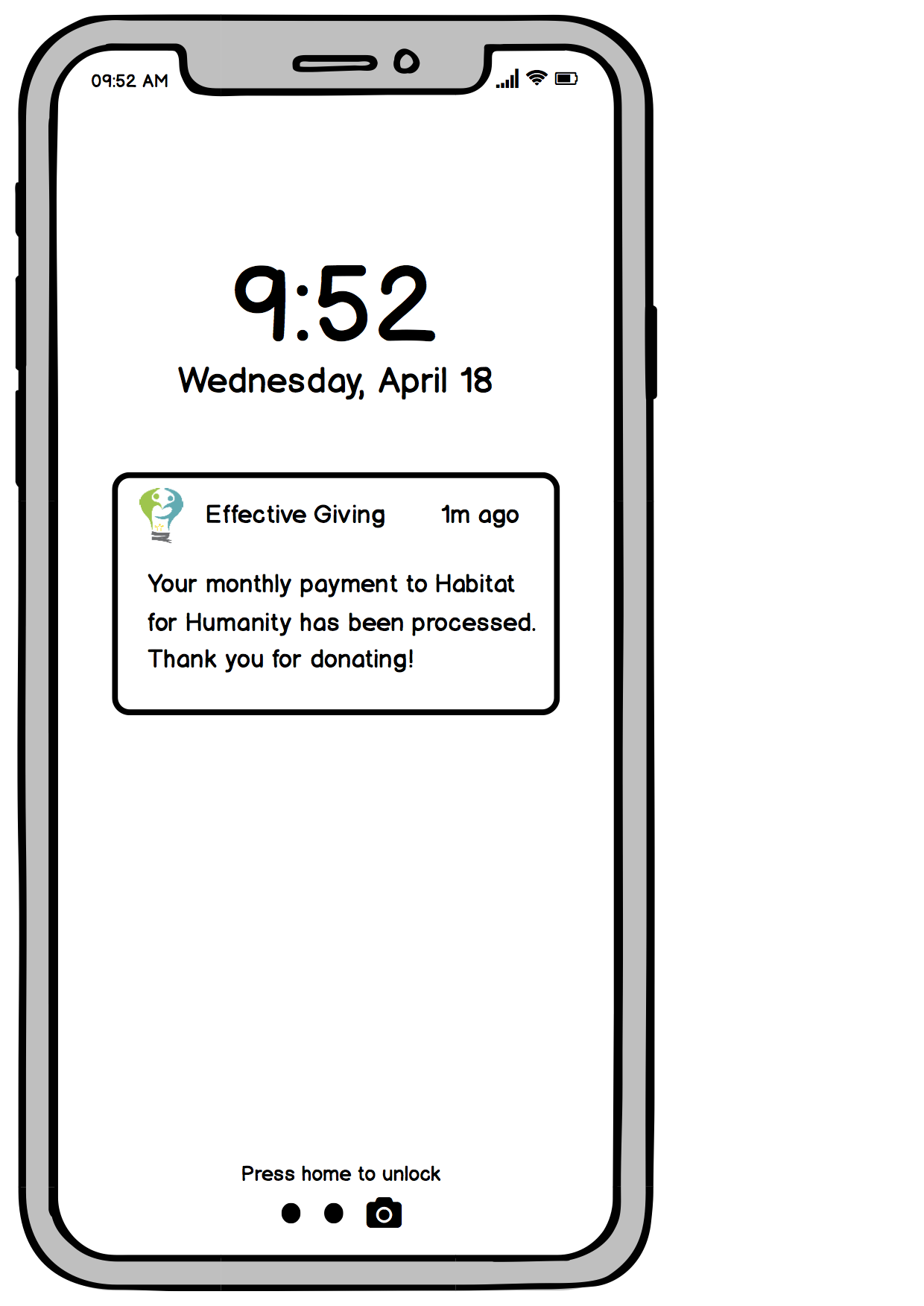
If the user opted for monthly recurring payments, the Effective Giving app will send her a notification.
Decisions and Changes in Digital Mockup
The features of our digital mockup do not stray far from our final paper prototype. However, transferring from a paper to digital representation shed light on some things that were not obvious before. In the page where the user enters their payment information, we added a question mark next to the “make monthly recurring payments” so that they could learn more about what that decision involved. Another change we made in the digital mockup was our use of the navigation bar in the top right corner of the screen. Although it is not significantly relevant in the walkthrough of our tasks, we thought that experienced users would want a quicker way to navigate through the charity profiles, so clicking the nav bar at the top would display a drop down menu of headings that they can quickly navigate to. 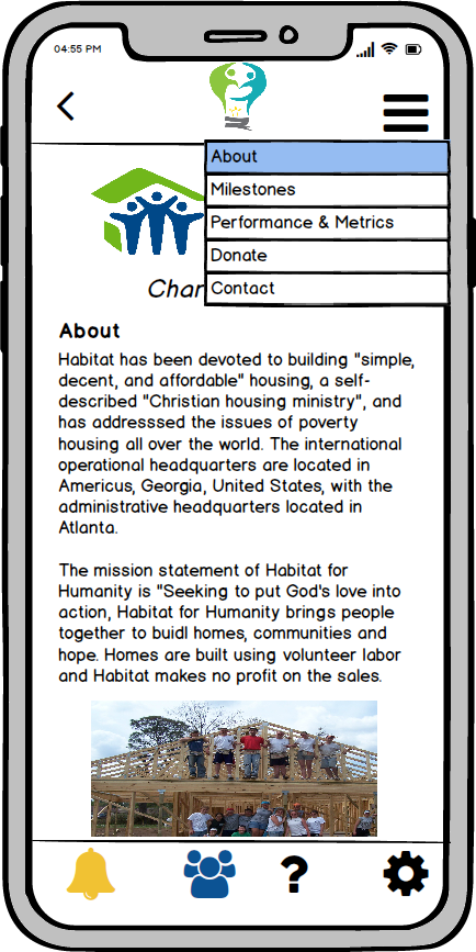
We decided to retain the other features of our final paper prototype as we transitioned into the digital mockup because we felt that the paper representation already resembled what we envisioned our mobile app to look like so most of the designs were sufficient and clear enough to transfer.
Interactive Demo
An interactive PDF copy of our mockups is available here.
Photo Sources:
Red Cross Logo
Red Cross Workers
Red Cross Workers in Haiti
Habitat For Humanity Logo
Habitat For Humanity Workers