Team
- Tiffany Zheng: Graphic Design, Prototyping, Research, Writing
- Mia Gancayco: Ideation, Research, Writing
- Michael Zuo: Development, Research, Writing
Problem and Solution Overview
Most of us want to help others and do good. It’s the reason why we donate to charities. However, our impact is ultimately limited by a) a lack of knowledge around how to give effectively, b) a lack of awareness around the impact of our donations, both large and small, and c) a lack of creative, effective channels to give that we can immediately access. The goal of Effective Giving is to create an app that provides information and resources necessary for making impactful donations. Our app aggregates established research on effective altruism and provides channels to facilitate the giving process to effective charities. By providing an information hub and making it easier to donate, the Effective Giving app will not only increase the amount of donations toward effective charities, but make the flow of donations to said charities more consistent, as well as promote collaboration among users in the giving process.
Initial Paper Prototype
Our initial paper prototype was the version we used in our first set of heuristic evaluations.
This version of the prototype is intended to support the two major tasks of learning about effective charities, and giving effectively without sacrificing convenience.
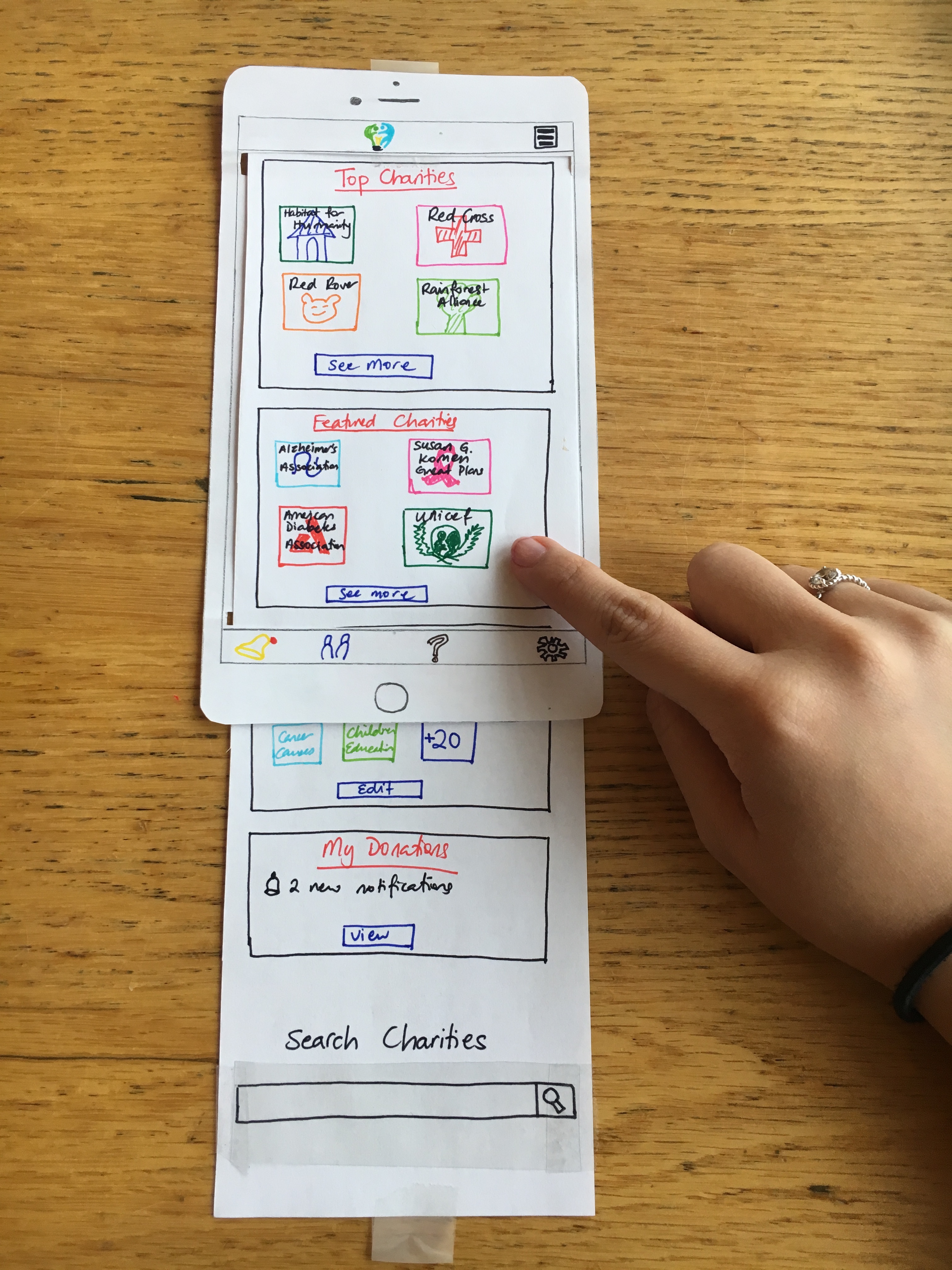
Task 1: Learning about effective charities
When the user starts the app, they are presented with the home page, showing topics of interests such as top charities, the causes the user cares about, and her donations. She wants to find out more about a specific charity, Red Cross, that sparked her interest.
The home page is scrollable, and in this version the user can scroll to the bottom of the page to find the search bar, where they can enter terms to search for more information.
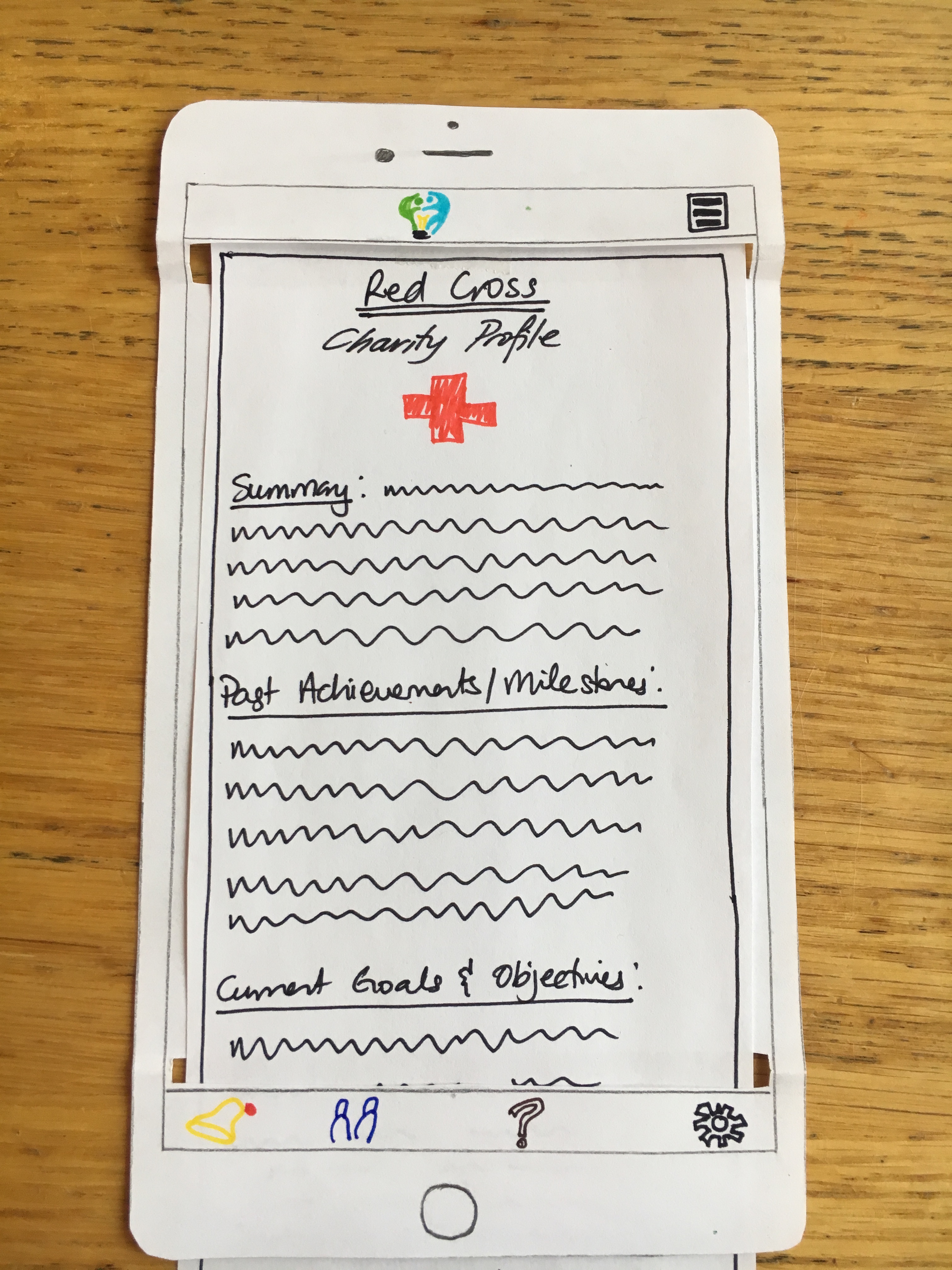
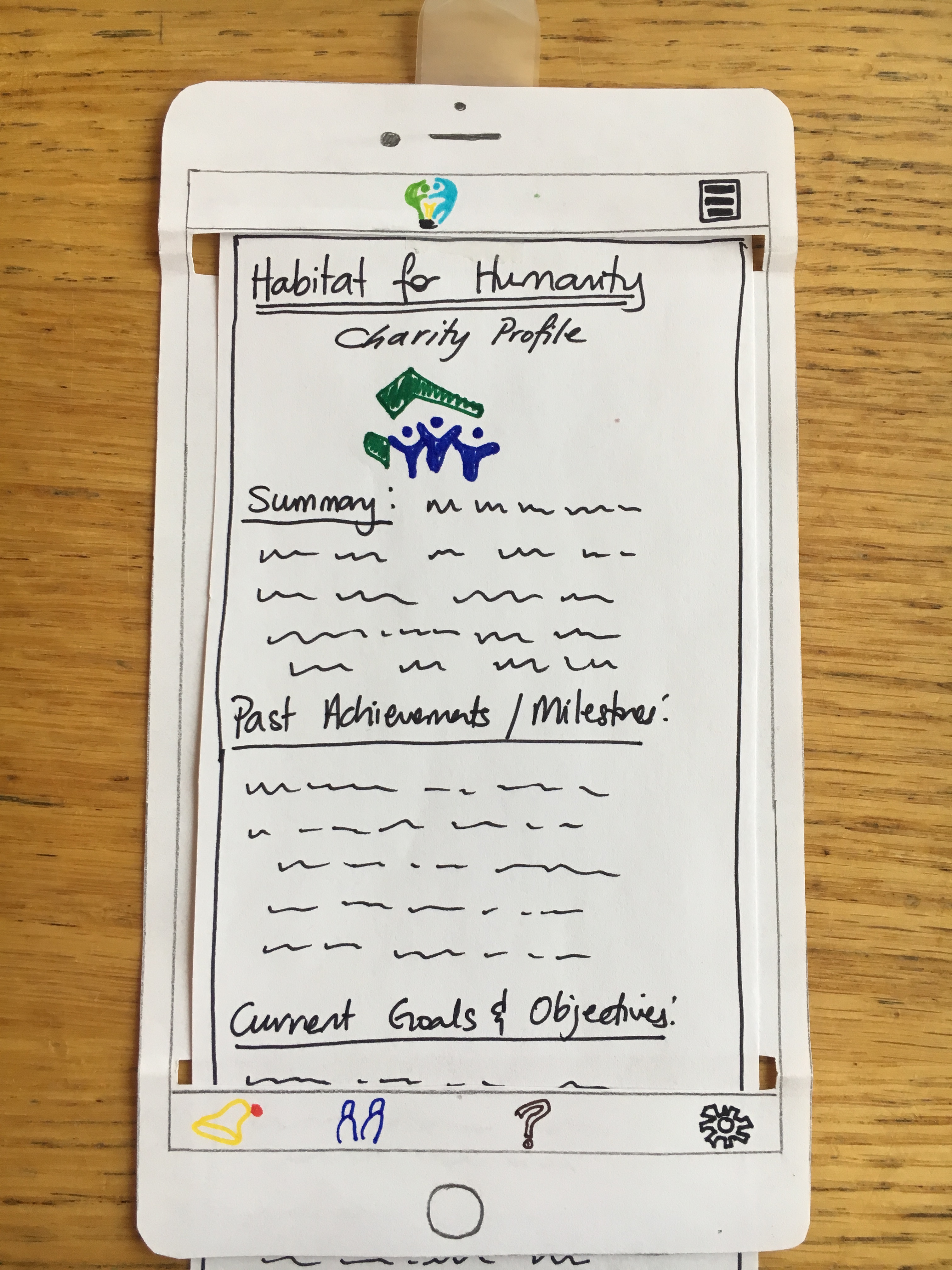
On entering a particular charity name, such as “Red Cross” into the search bar, and pressing on the magnifying glass to perform the search, the user is directed to a charity profile page for the specified charity, if it is found. In this version of our paper prototype, our charity profiles are very abstract, and contain only headings and fake text placeholders representing a general overview of the charity (Red Cross), including a summary of the charity, its past achievements and milestones, its current goals and objectives, its performance and metrics (as released by organizations that typically assess the effectiveness of charities such as CharityWatch and GiveWell), and resources for the user to learn more such as a link to the charity’s website and social media platforms.
If the user clicks on the Effective Giving logo at the top, she will be brought back to the home screen to explore further or search for other topics of interest.
Task 2: Giving effectively without sacrificing too much convenience
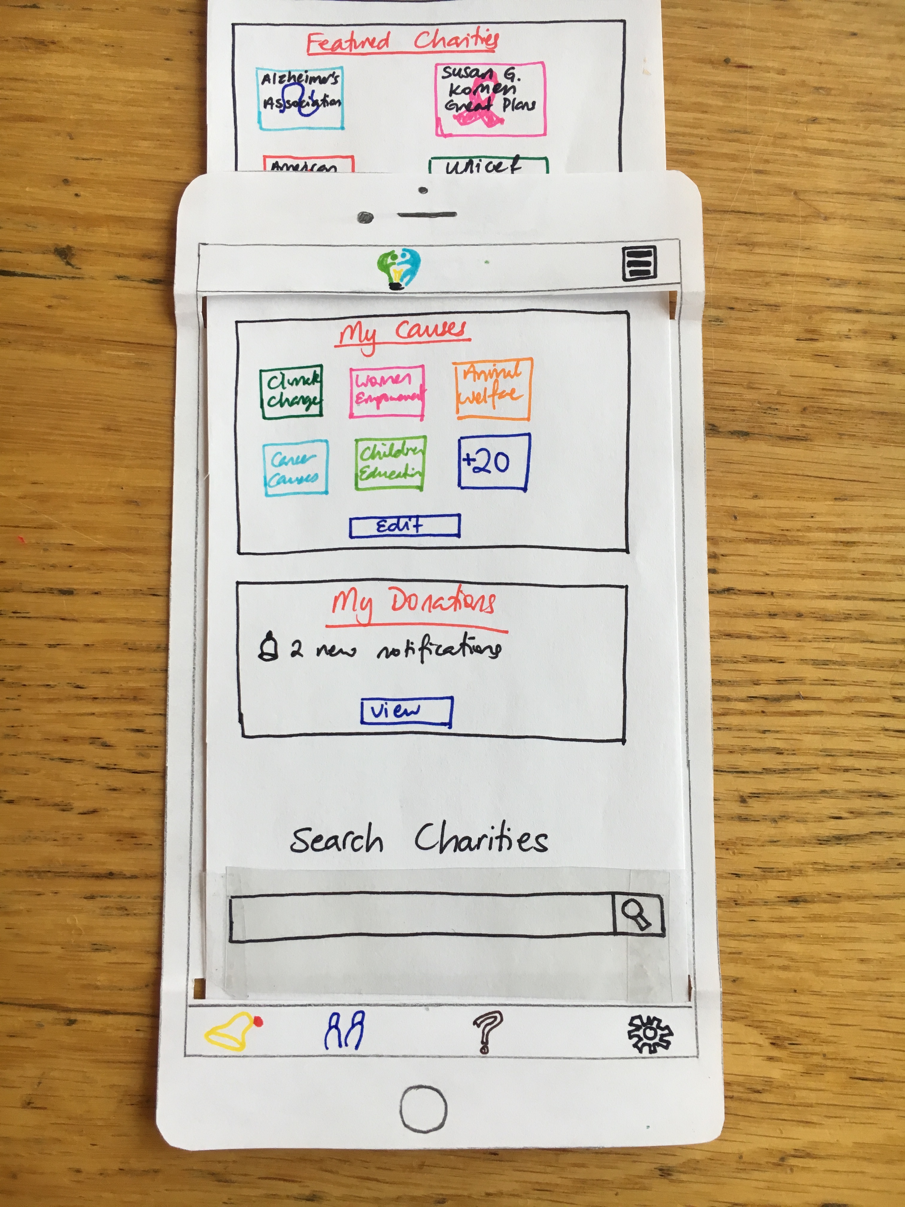
For users who have already done their research and are interested in donating to a specific charity, the user can find their preferred charity, in this case Habitat for Humanity, by the process above.
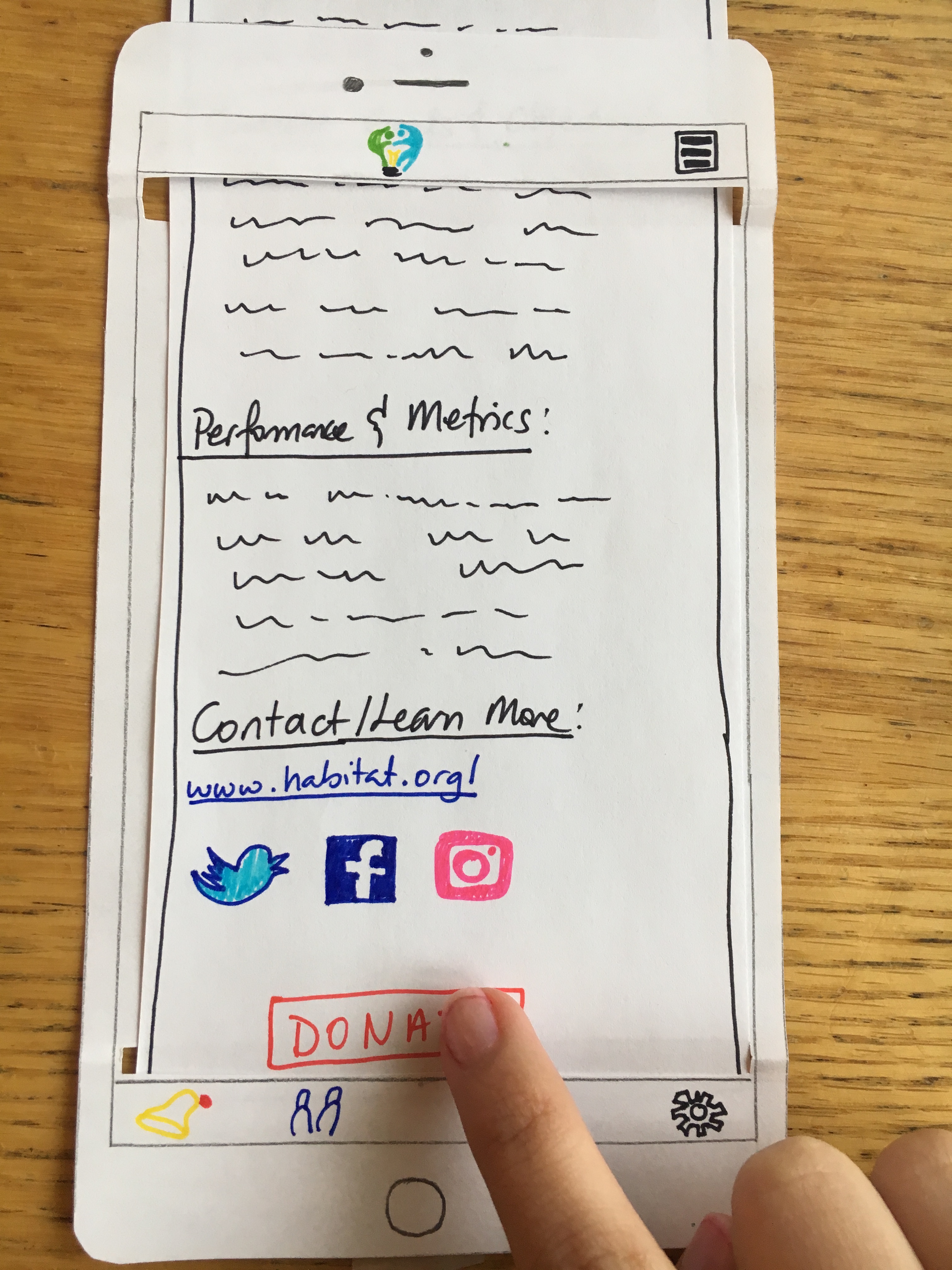
A Donate button is placed at the bottom of the charity information page. In our initial paper prototype, the donate button is placed at the very bottom, so that there’s nothing else on page after it for the user to look at.
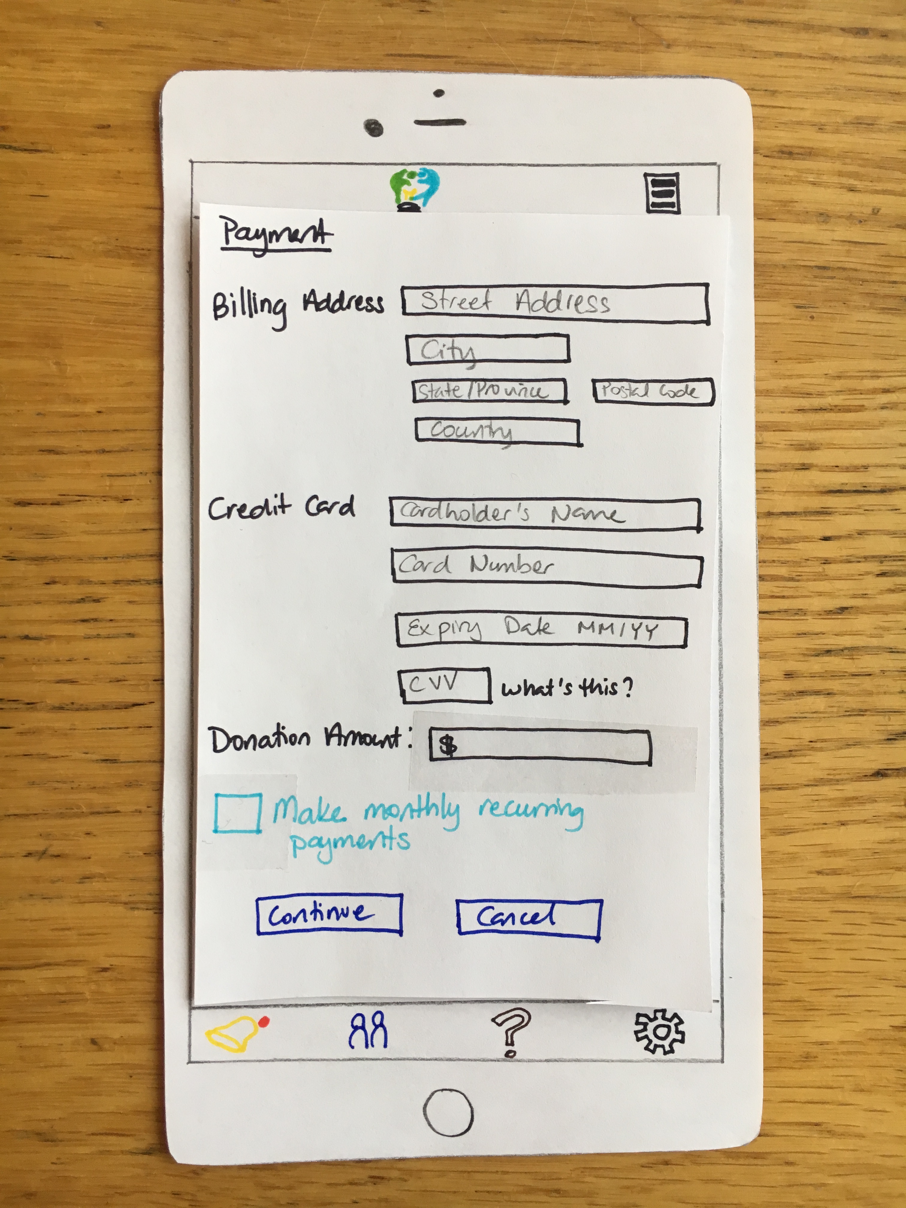
On clicking the donate button, the user is directed to a page where she can input her payment information in order to make her donation, which consists of basic credit card information such as the user’s billing address, the cardholder name, the number, CVV, and expiry date of the card. Each of these text fields contain “placeholder” or greyed-out labels that inform the user what information to enter. The labels within the text field disappear when the user clicks on it to type. The user then specifies how much money she wants to donate by entering a numerical value in the text field labeled “Donation Amount”. There is also an option below where she can choose to make the donation a monthly recurring payment, so her credit card would then be processed for the donation amount that she specifies on a monthly basis. If the user does not check this box, the donation will be a one-time payment of the amount specified.
Testing Process
Our testing process involved in class heuristic evaluations done with our classmates, as well as three usability tests with our paper prototypes on participants who are current students at Williams College. The heuristic evaluations involved partnering up with other groups and having their team members judge our paper prototypes according to a set of heuristics, identifying areas of concern and offering suggestions. This provided much insight on how we could refine our design to make our interface more intuitive. Our usability testing participants were 1) a female student who regularly attends Sunday Mass at a local church whose profile fits with the religious group demographic that our design targets 2) a male student with a quantitative background with a decision-making process we believed would be similar to that of effective altruists due to his interests in statistics and economics, and 3) a female student who is involved with larger charity organizations on campus such as CLIA, who we thought could provide insight on how members of these organizations decided to donate. For the first and third usability tests, we divided the roles of notetaker, facilitator, and computer among our three team members. For the second usability test, we had one team member be the computer and the other act as the facilitator/notetaker.
We asked our participants to perform two tasks: 1) learn about effective charities and 2) give without sacrificing convenience. We presented these tasks the same way to these three participants. We felt that recreating the task processes in our scenarios (simply searching for “Red Cross” and making a monthly recurring payment to Habitat for Humanity) would not give us much insight on the usability of our app since those processes are rather short and straightforward. Instead, we presented our tasks to the participants more generally by first asking them to 1) use our app to learn about charities and their effectiveness and afterwards 2) choose a charity to donate to. We informed them which charity profiles were “under construction” and which ones we had ready. Although the monthly recurring payments are a part of the “convenience” aspect of our second task, when the participants were ready to donate, we let our users decide whether they wanted to make a recurring payment to gauge the appeal of this feature. We asked the participants to think aloud while they were navigating our prototypes and did not answer questions or provide help unless it was absolutely necessary. At the end of both tasks, we asked our participants whether they had any general thoughts, questions, or suggestions about our application.
In addition to our design revisions, we adjusted our testing process as we gained insight from each usability test. In our first usability test, our participant had few problems navigating the design. As we simulated the design, our user noticed which screens our paper prototype could present, which in turn affected her behavior. Consequently, we decided to hide the overall paper prototype from our users beforehand. During the second usability test, our participant had problems finding the “donate” button because he did not realize how much further the page could scroll. We made sure that we explained to our third participant that we would tell her when she could not scroll any more on a given page. Our skills in conducting these usability tests also improved after each one, as we became more comfortable simulating the app and encouraging the participant to think aloud.
Testing Results
Our testing process yielded much insight in how to make our design more intuitive and better facilitate user tasks. We had several iterations of our paper prototype throughout the testing process as we found new flaws and areas for improvement in our design. The first round of testing we did involved in class heuristic evaluations. The evaluations we received shed light on the flaws of the first version of our paper prototype. The main aspects that were lacking in our first version were the absence of a distinct back button, a search bar at the bottom of the page that was difficult to find, the lack of a “done” button after users are finished with making payments, the ability to retroactively change donation patterns for charities, and ambiguity in what “top charities” meant in our home page. We made the relevant changes as a result of these concerns by adding a back button, moving the search bar to the top of our home page, adding a “done” button to our payment page, offering a clear option for users to view and edit their donations from the home page, and changed “top charities” to “top effective charities”. These refinements made our design much more intuitive. We did most refinements to our design during this phase of the testing process since it was the first version of our paper prototype, and our classmates’ knowledge of relevant usability heuristics allowed them to provide detailed and helpful suggestions. Following our professor’s suggestion, we also added a larger blinder for our paper mobile phone so that users do not see the contents of a page immediately beyond what is shown on the screen, which could guide their actions.
We also made some refinements to our paper prototype and design after each usability test. Our three participants made us aware of issues and concerns in our design that were not quite obvious without actually walking through the user tasks with our prototypes. After conducting our first usability test with our second version of our paper prototype (refined from suggestions made in the heuristic evaluations), we realized that it would be helpful to have actual content in the charity profile pages in our prototype rather than squiggly lines as words. We made the decision to include actual information summarizing key aspects of the charities in our paper prototype (Habitat for Humanity and Red Cross) to gain a better understanding of how participants navigated this content and how much time they would spend reading it when making decisions to donate, since user learning is integral to our design goals. With this refined third version of our paper prototype, we conducted our second usability test. Our second participant highlighted an issue with the placement of our donate button at the bottom of the charity profile page. Taking into consideration his difficulty in finding this button, we decided to move the donate button above the contact information for the given charity so it would be clearer to the user that they could donate from the app itself without having to go to the charity’s website to do so. Another refinement we made as a result of our second usability test is adding a link to a guide in our home page that instructs users in how to make effective donations since our second participant mentioned a desire for a little more guidance and structured way to approach investigating his charity options. We made these refinements and used this fourth version of our paper prototype to conduct our third usability test. Our third participant highlighted the lack of engaging pictures to capture users’ attention in our charity profile pages. As a result, we further refined our paper prototype once more to include relevant photos in charity profile pages. All these changes were incorporated into our final version of our paper prototype.
For our digital mockups, we used the final version of our paper prototype and did not change much of the design. Our first version of the digital mockup varied from our final paper prototype in that we added a few changes to the layout of certain pages. We added a question mark next to the “make recurring payments” so that users could learn more about what that involved, and also used a navigation bar in the top right corner of the screen so that experienced users can better navigate through the charity profile pages. We retained the other features of our final paper prototype as we transitioned to our digital mockup. Upon receiving feedback from our professor on our digital mockups, we made a few additional changes to our design. We made our search bar wider so that it would be easier for users to click, changed the color of our “make monthly recurring” option so that it would be easier to read, and added the name of the charity to the “thank you for your donation” screen.
Final Paper Prototype
In our final paper prototype, we incorporated changes that we found were necessary through heuristic evaluation and user testing. As before, the main tasks our paper prototype supports are learning about effective charities, and giving effectively without sacrificing convenience.
An overview of our final paper prototype is available at our paper prototype page. In this document, we highlight the changes made to our design as a result of testing.
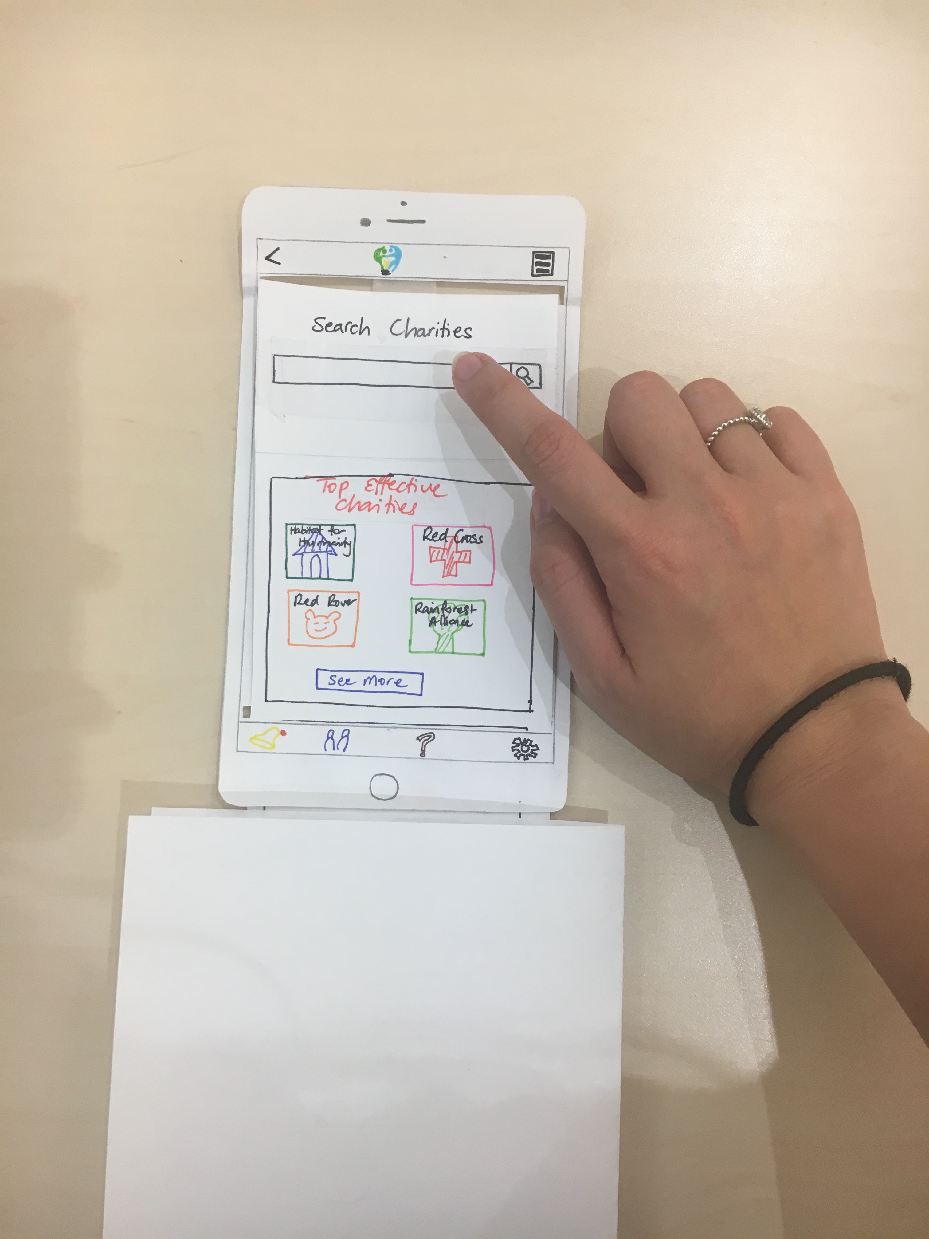
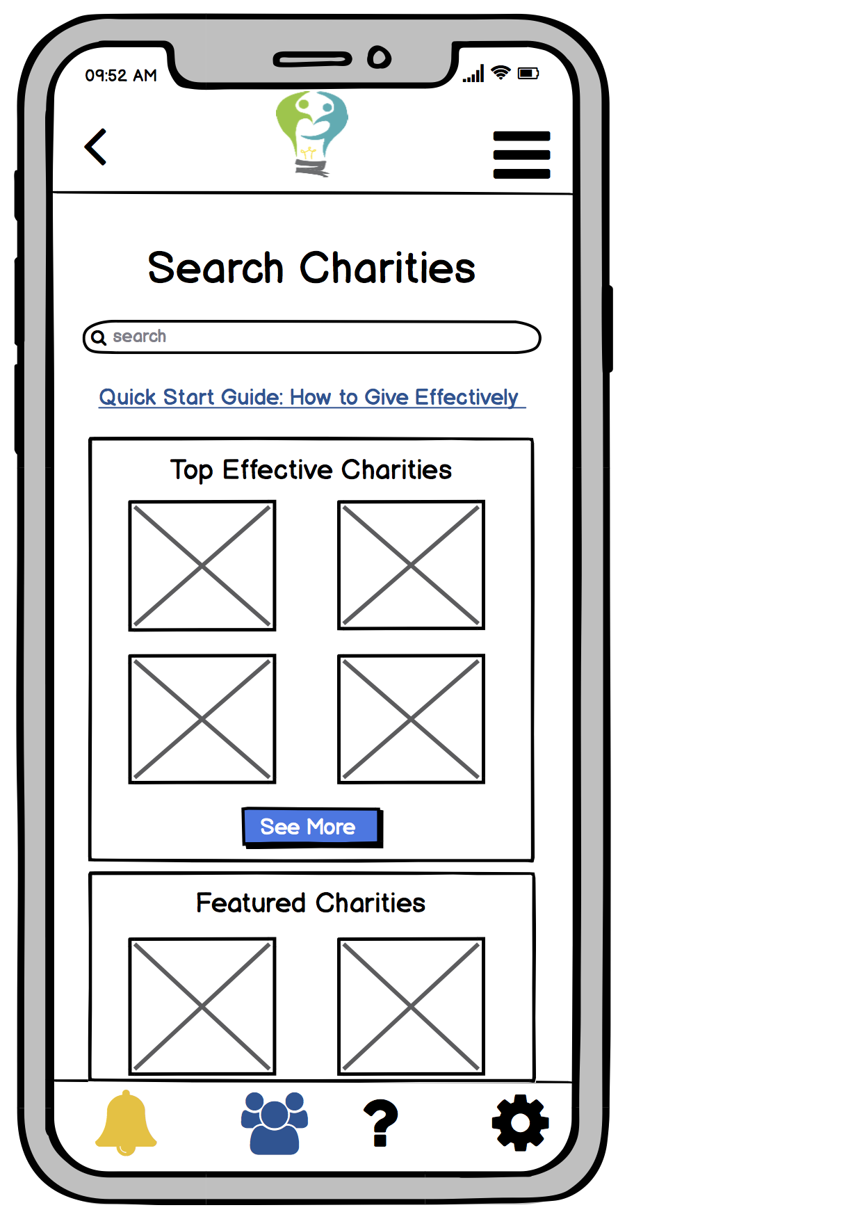
We relabelled our category of “top charities” to “top effective charities”, based on feedback that it was unclear the sense in which the charities listed in that section were “top”. We believe this label more accurately conveys the idea that these charities are displayed because they are considered the most effective charities we have information about by some metric.
Since the home page is scrollable, we found that users had difficulty finding the search bar when it was at the bottom of the page, as they would not necessarily notice the presence of the search bar until they reached the bottom of the home page. It was possible to interact exclusively with the charity recommendations without noticing that search functionality was available.
In addition, we added a blinder to our testing procedure to block out the bottom sections of long page so that users would not see content which would not actually be in the viewport of the app.
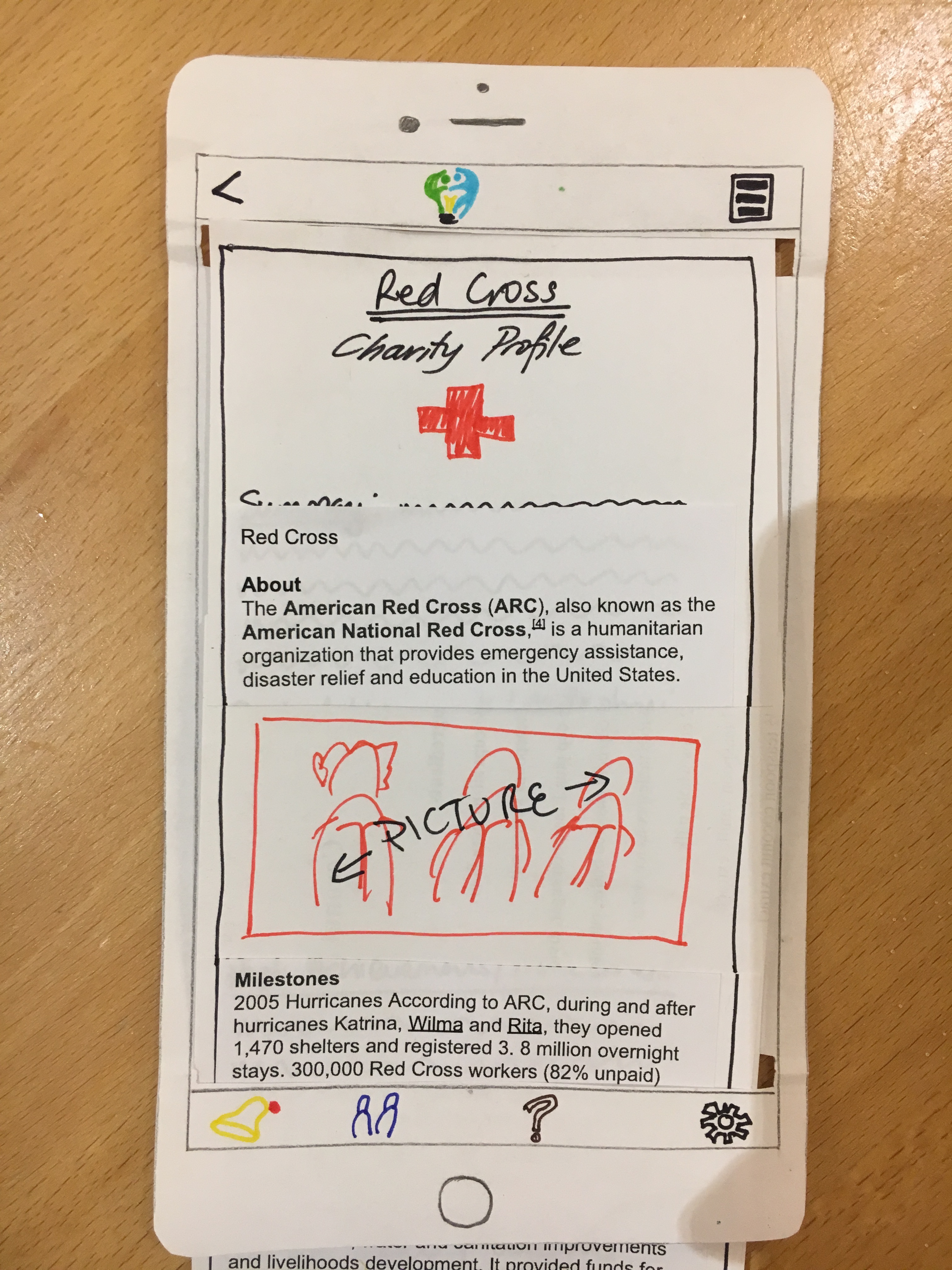
During user testing, we decided to added real text to our charity profile pages. We found that users were less able to engage with the informational pages when there was no real information, so testing was more information when the user had actual text to read. In addition, we added image placeholders to break up text on the observation that walls of text would put users off.
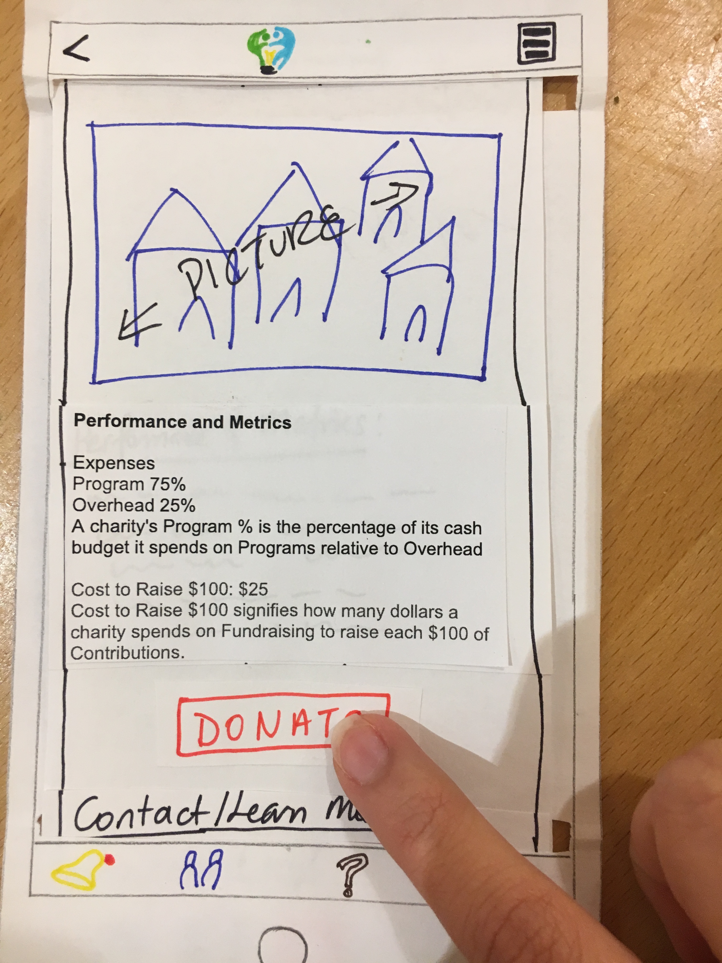
We moved the Donate button above the contact information for the charity on charity information pages, as one of our users assumed that the contact information represented the end of the article and did not consider scrolling further. This user had considerable difficulty finding the donate button, as they expected to find it closer to the content of the page.
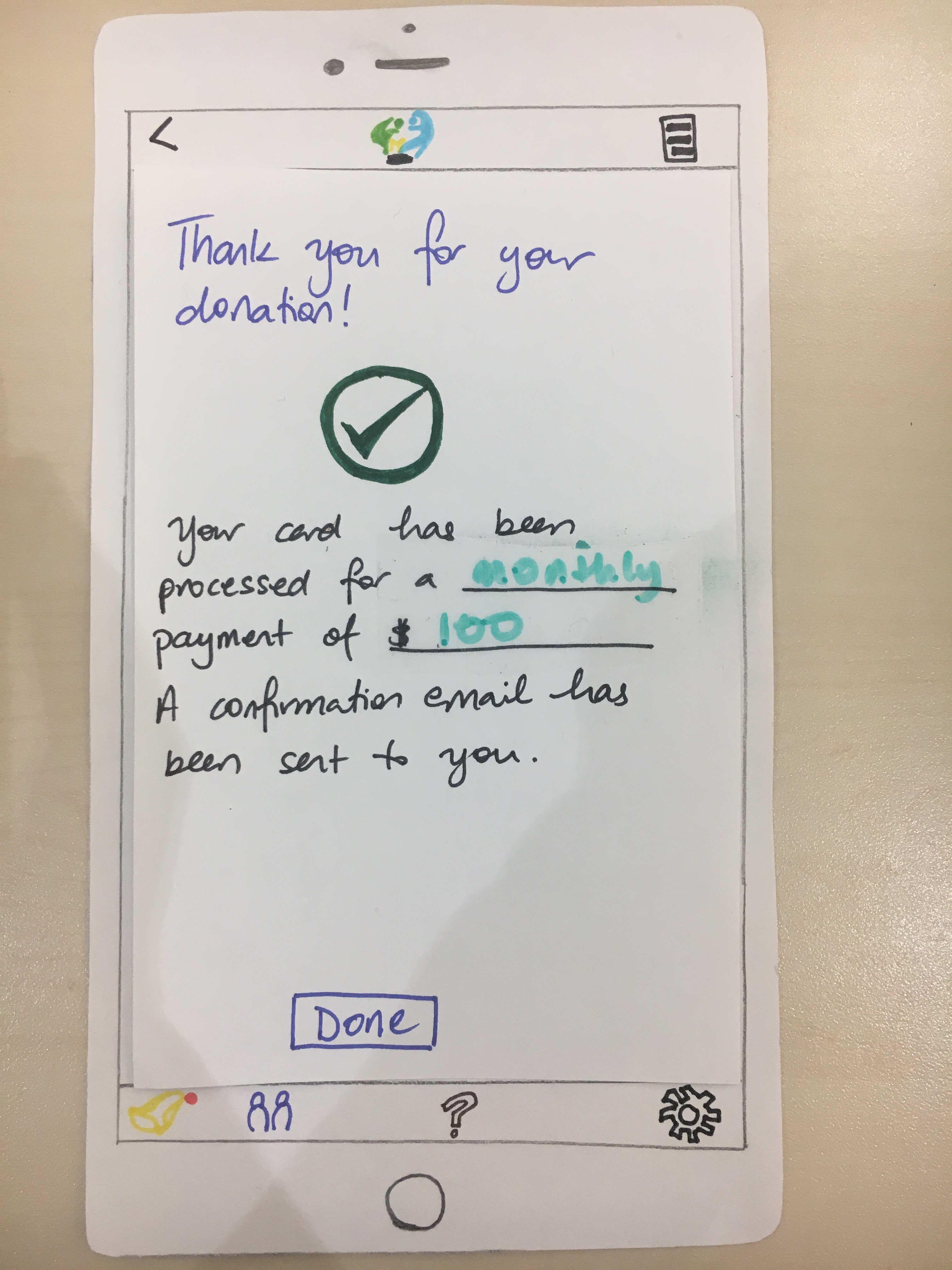
On the donation confirmation page, we added a Done button to return to the home page, so that the user is not trapped after completing a donation. In addition, we added back buttons throughout the paper prototype to give the user a consistent way to backing out an action.
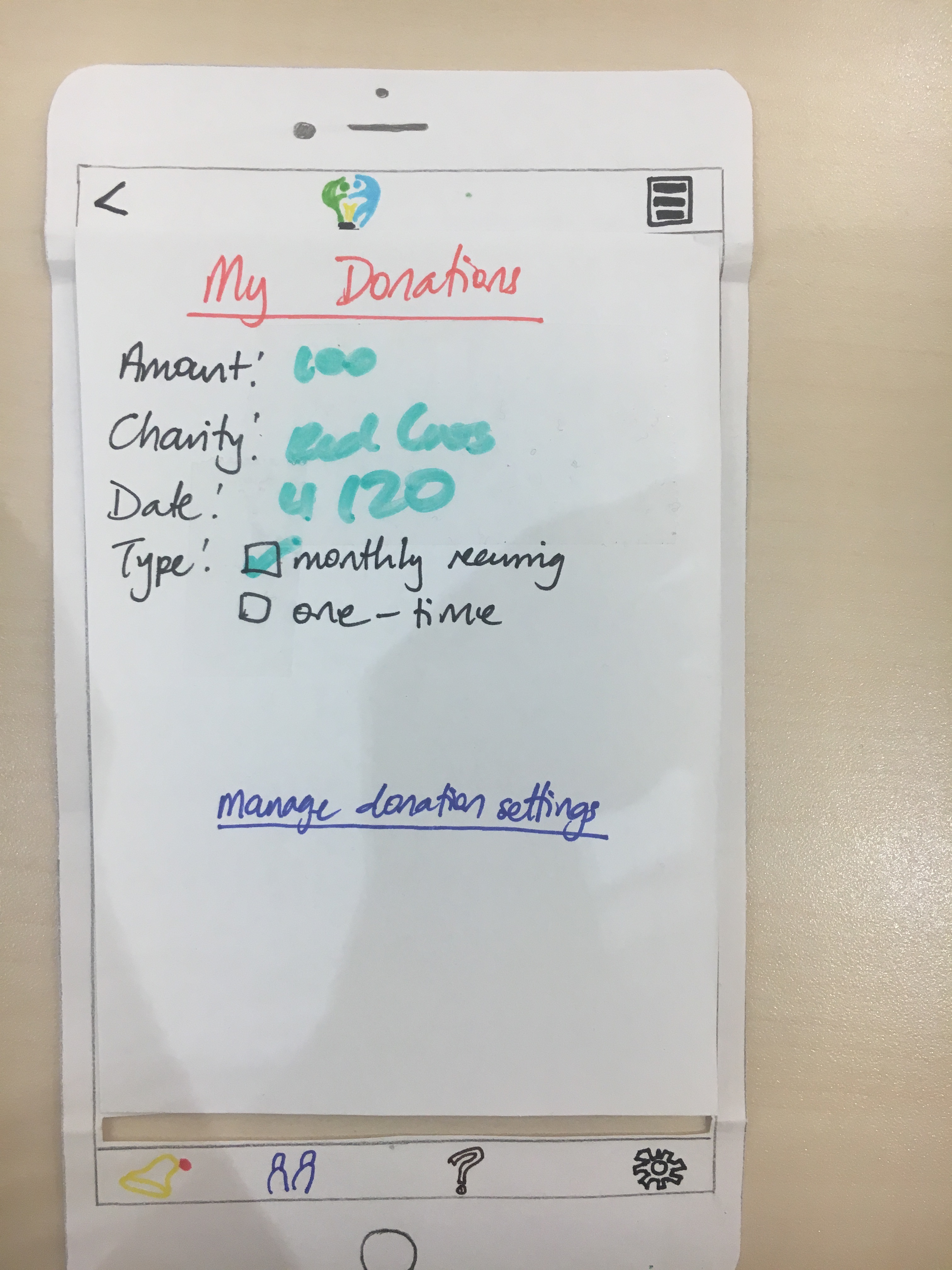
We included a screen, reachable from the notification generated when a monthly payment is processed, which details the donation made and the user’s settings for further donations to the selected charity. This screen provides a link intended to allow the user to change/cancel their donation settings, amount, frequency, etc..
Digital Mockup
Our digital mockup was based on our final paper prototype and incorporates the changes made to our initial paper prototype during the course of testing, as well as incorporating aspects which are made more feasible by the digital nature of this prototype over the paper prototypes.
An overview of our digital mockup is available at our digital mockup page. In this document, we detail only critical aspects of the design as well as changes made by switching from paper to Balsamiq, a digital tool.
Throughout our app, our digital mockup provides a more consistent user interface, with back buttons and a drop-down menu of sections available on every page.
On our home page, we added a link to a “Quick Start Guide”, immediately offering information instead of expecting the user to go through the help interface to find this information, in order to provide explanation to users who may not necessarily be familiar with the goals endorsed by Effective Giving.
As before, our two primary tasks of interest are learning about effective charities, and giving effectively without sacrificing convenience. Our digital prototype is fully linked to support performing these two tasks.
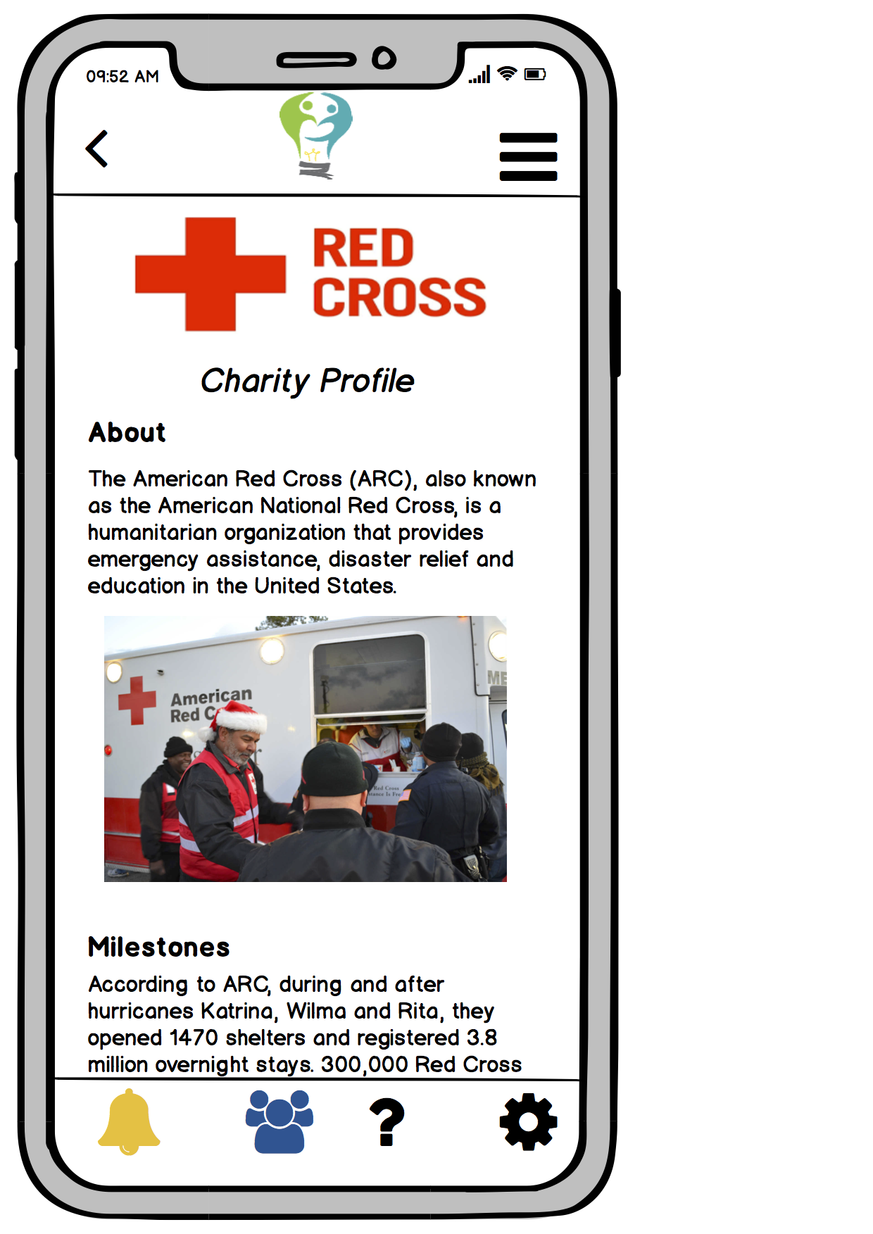
On our charity profiles, as in our final paper prototype, unlike our initial paper prototypes, we included actual text describing the charity in question instead of placeholder squiggles. In addition, since the digital format makes image reproduction a lot easier than on drawing on paper, we are able to include images as well instead of placeholders of image to break up the text and hopefully engage the user in reading it a bit more.
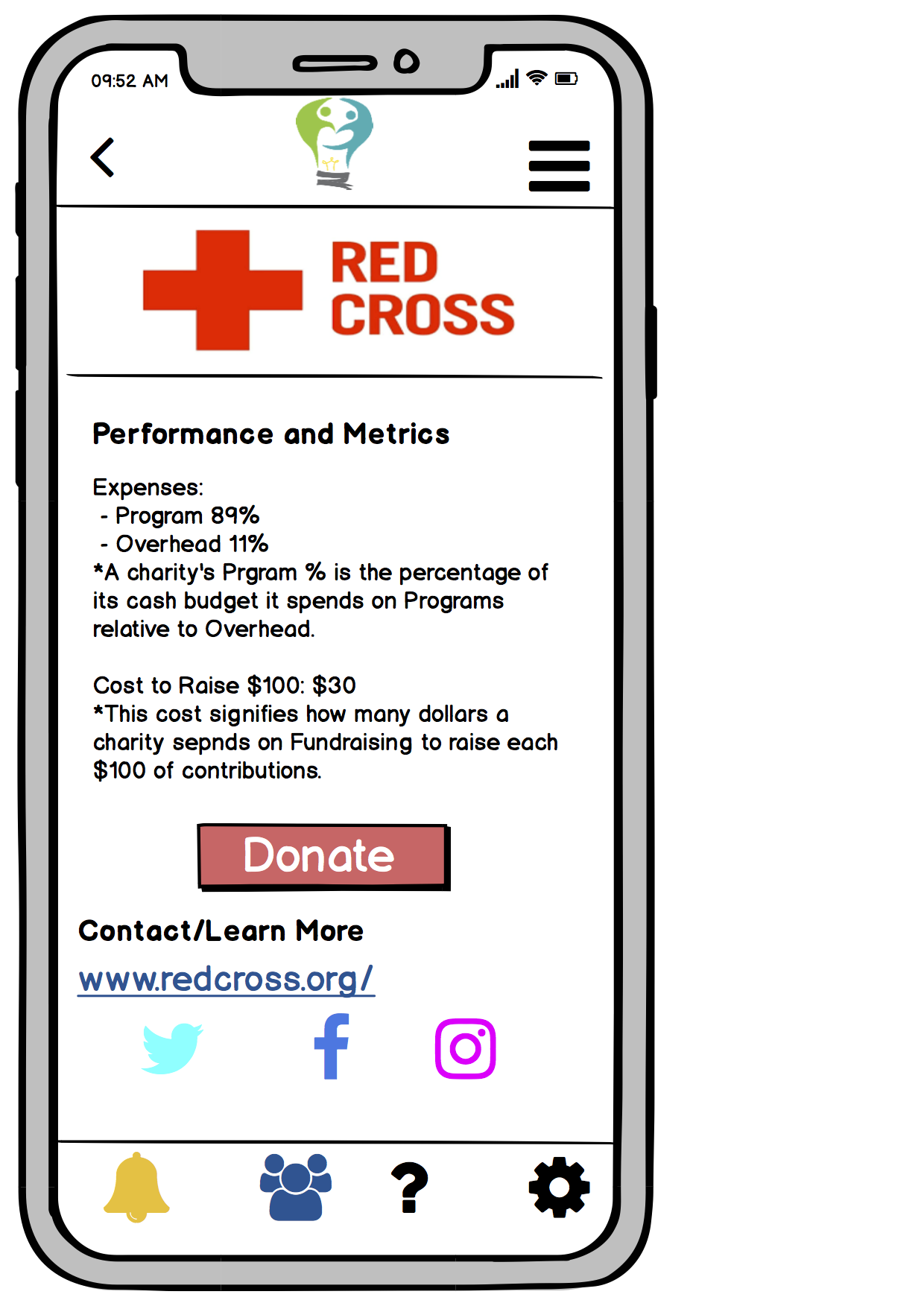
As in our final paper prototype, the Donate button is now placed just before the contact information for the charity. In our digital prototype, we make buttons stand out from surrounding text by filling them with colour background. In the case of the Donate button in particular, the button is red, as opposed to blue on most buttons in our design, to signify its special importance.
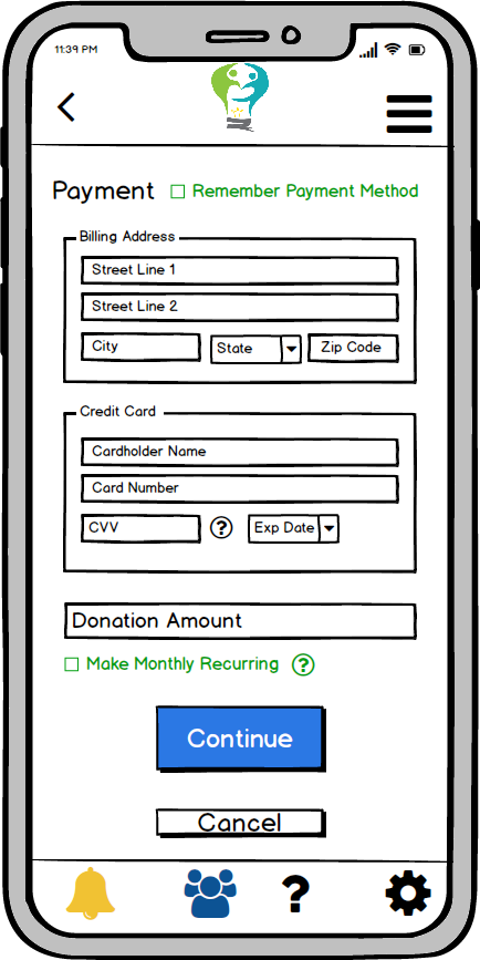
The user is directed from the donate button to input payment information. On this page, we include a toggle allowing the user to have payment information stored by our service to facilitate making donations to multiple charities without having to repeated enter payment information.
The option to make monthly recurring donations remains a critical element of our design, which serves our second major goal of giving effectively without sacrificing convenience by allowing a user to make donations on a recurring basis without additional ongoing effort.
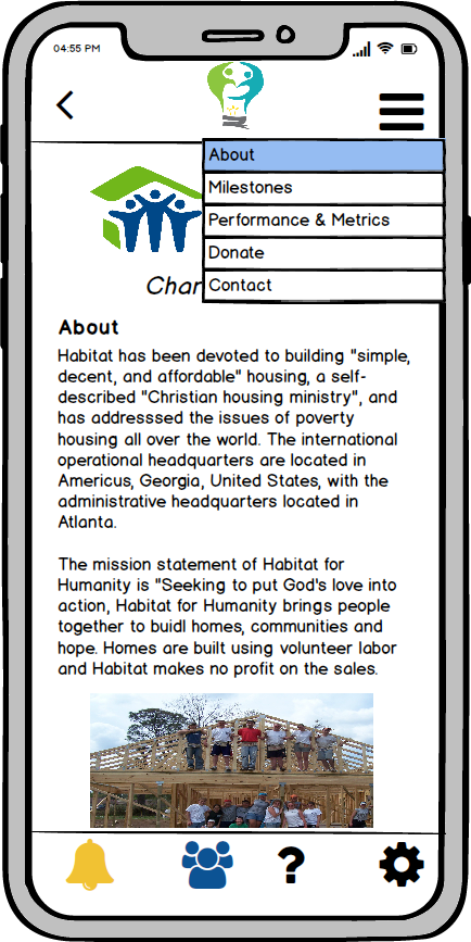
For expert users, the dropdown allows jumping directly to the donate section to avoid rereading content about a charity they are already familiar with. It is an explicit design decision not to place the Donate button at the top of the page, where the user may click it immediately, because allowing the user to ignore the charity assessment without active intent runs counter to our first goal of learning about effective charities.
Discussion
We realized that the idea of a platform that would help users give more effectively to charities was much more complex and involved than it sounded. The process of iterative design that this project involved really helped us realize and solidify what we wanted our design to achieve and the best ways to facilitate our user tasks. The iterative process was beneficial because it allowed us to build on our design gradually, taking time to really consider whether we needed to incorporate suggested adjustments. A good aspect of this iterative design is that it allowed us to constantly improve throughout our testing process. In offering refined versions for user testing, we could identify new issues rather than potentially having users reiterate the suggestions that were already made in the past by previous users. We learned that although the feedback we gather from our testing process is crucial to understanding the flaws of our design, it is necessary for our team to prioritize what adjustments are most necessary and which ones are not in line with our project goals and overall vision. There were several times when our team had to balance the desire for convenience with motivating the user to become truly engaged in the donation process. Another thing we learned is that no matter how much our team feels that a design is sufficient and intuitive, feedback is necessary to identify issues that we failed to consider.
In shaping our final design, we feel that the heuristic evaluations resulted in the most significant adjustments to our paper prototypes, mainly because it was the first round of testing on our initial version which had much room for improvement. The heuristic evaluations were responsible for a lot of the more intuitive adjustments that we incorporated in our final design such as a back button, placement of search bar, and functionality to help users edit donation patterns. The usability tests that we conducted shed light on more minor adjustments in our final design such as adding pictures to charity profiles, moving the donate button slightly upwards on the charity profile pages, and adding actual content to our prototypes that our participants could read and engage with. As we went through the testing process, our need to make adjustments to our design decreased, which is a good indication that our prototype was improving.
The two integral tasks that we wanted to facilitate in our design (1. learning about effective charities and 2. giving effectively without sacrificing convenience) remained the same throughout our testing process as we felt that those tasks adequately conveyed our goals for the platform. However, the presentation of the tasks to users deviated from the specific scenarios in our storyboards that illustrated these tasks. Rather than telling our participants in our usability tests to recreate the task processes illustrated in our storyboard scenarios (simply searching for “Red Cross” and making a monthly recurring payment to Habitat for Humanity), we made the instructions more flexible by telling them to use our app to learn about charities and their effectiveness and then choose a charity to donate to. During our testing process, we realized that this was a good decision as people explore and learn about charities in different ways and not all participants were interested in making monthly recurring payments. Our two integral tasks have not changed throughout the testing process; we just made it more general and flexible when presenting it to users rather than sticking to the specificity of the tasks scenarios in our storyboards.
We think we could have used more iterations on our design. One thing that we think could have been helpful is performing usability tests on participants who were not students at Williams, for example working adults who are engaged with charitable giving. Due to the time and availability constraints of our team, this was difficult to accomplish during our testing process. Another activity that would have been helpful is to conduct usability tests with our digital mockups rather than paper prototypes to see the differences in how participants interact with our design. This could give us a better understanding of how usable our interface is since the digital mockup is the closest rendition of how our final application would look like.
Appendix
Here are relevant links to materials involved in our testing: